CSS 实用工具
Ionic Framework 提供了一组 CSS 实用程序类,可在任何元素上使用,以便修改文本、元素位置或调整填充和边距。
🌐 Ionic Framework provides a set of CSS utility classes that can be used on any element in order to modify the text, element placement or adjust the padding and margin.
如果你的应用不是使用可用的 Ionic Framework 启动模板启动的,则需要包含全局样式表的可选部分中列出的样式表,才能使这些样式生效。
文本修改
🌐 Text Modification
文本对齐
🌐 Text Align
<ion-grid>
  <ion-row>
    <ion-col>
      <div class="ion-text-start">
        <h3>text-start</h3>
        Lorem ipsum dolor sit amet, consectetur adipiscing elit. Sed ac vehicula lorem.
      </div>
    </ion-col>
    <ion-col>
      <div class="ion-text-end">
        <h3>text-end</h3>
        Lorem ipsum dolor sit amet, consectetur adipiscing elit. Sed ac vehicula lorem.
      </div>
    </ion-col>
    <ion-col>
      <div class="ion-text-center">
        <h3>text-center</h3>
        Lorem ipsum dolor sit amet, consectetur adipiscing elit. Sed ac vehicula lorem.
      </div>
    </ion-col>
  </ion-row>
  <ion-row>
    <ion-col>
      <div class="ion-text-justify">
        <h3>text-justify</h3>
        Lorem ipsum dolor sit amet, consectetur adipiscing elit. Sed ac vehicula lorem.
      </div>
    </ion-col>
    <ion-col>
      <div class="ion-text-wrap">
        <h3>text-wrap</h3>
        Lorem ipsum dolor sit amet, consectetur adipiscing elit. Sed ac vehicula lorem.
      </div>
    </ion-col>
    <ion-col>
      <div class="ion-text-nowrap">
        <h3>text-nowrap</h3>
        Lorem ipsum dolor sit amet, consectetur adipiscing elit.
      </div>
    </ion-col>
  </ion-row>
</ion-grid>
| 类别 | 样式规则 | 描述 |
| --- | --- | --- |
| .ion-text-left | text-align: left | 内联内容对齐到行盒的左边缘。 |
| .ion-text-right | text-align: right | 内联内容对齐到行盒的右边缘。 |
| .ion-text-start | text-align: start | 如果方向是从左到右,则与 text-left 相同;如果方向是从右到左,则与 text-right 相同。 |
| .ion-text-end | text-align: end | 如果方向是从左到右,则与 text-right 相同;如果方向是从右到左,则与 text-left 相同。 |
| .ion-text-center | text-align: center | 内联内容在行框内居中。 |
| .ion-text-justify | text-align: justify | 内联内容是对齐的。文本应按照行框的左右边缘对齐其左右边缘,最后一行除外。 |
| .ion-text-wrap | white-space: normal | 空白序列会被折叠。源中的换行符被视为其他空白处理。必要时换行以填充行框。 |
| .ion-text-nowrap | white-space: nowrap | 像 normal 一样折叠空白,但在文本内抑制换行(文本换行)。 |
文本变换
🌐 Text Transform
<ion-grid>
  <ion-row>
    <ion-col>
      <div class="ion-text-uppercase">
        <h3>text-uppercase</h3>
        Lorem ipsum dolor sit amet, consectetur adipiscing elit. Sed ac vehicula lorem.
      </div>
    </ion-col>
    <ion-col>
      <div class="ion-text-lowercase">
        <h3>text-lowercase</h3>
        Lorem ipsum dolor sit amet, consectetur adipiscing elit. Sed ac vehicula lorem.
      </div>
    </ion-col>
    <ion-col>
      <div class="ion-text-capitalize">
        <h3>text-capitalize</h3>
        Lorem ipsum dolor sit amet, consectetur adipiscing elit. Sed ac vehicula lorem.
      </div>
    </ion-col>
  </ion-row>
</ion-grid>
| 类别 | 样式规则 | 描述 |
|---|---|---|
.ion-text-uppercase | text-transform: uppercase | 强制将所有字符转换为大写。 |
.ion-text-lowercase | text-transform: lowercase | 强制将所有字符转换为小写。 |
.ion-text-capitalize | text-transform: capitalize | 强制将每个单词的首字母转换为大写。 |
响应式文本类
🌐 Responsive Text Classes
上面列出的所有文本类都有额外的类可以根据屏幕大小修改文本。在每个类中的 text- 改为使用 text-{breakpoint}-,以便只在特定屏幕尺寸上使用该类,其中 {breakpoint} 是 Ionic Breakpoints 中列出的断点名称之一。
🌐 All of the text classes listed above have additional classes to modify the text based on the screen size. Instead of text- in each class, use text-{breakpoint}- to only use the class on specific screen sizes, where {breakpoint} is one of the breakpoint names listed in Ionic Breakpoints.
下表显示了默认行为,其中 {modifier} 可以是以下任意一个:left、right、start、end、center、justify、wrap、nowrap、uppercase、lowercase 或 capitalize,如上所述。
🌐 The table below shows the default behavior, where {modifier} is any of the following: left, right, start, end, center, justify, wrap, nowrap, uppercase, lowercase, or capitalize, as they are described above.
| 类别 | 描述 |
|---|---|
.ion-text-{modifier} | 在所有屏幕尺寸上将修饰符应用于元素。 |
.ion-text-sm-{modifier} | 当 min-width: 576px 时将修饰符应用于元素。 |
.ion-text-md-{modifier} | 当 min-width: 768px 时将修饰符应用于元素。 |
.ion-text-lg-{modifier} | 当 min-width: 992px 时将修饰符应用于元素。 |
.ion-text-xl-{modifier} | 当 min-width: 1200px 时将修饰符应用于元素。 |
元素放置
🌐 Element Placement
浮动
🌐 Float
float CSS 属性指定元素应放置在其容器的左侧或右侧,文本和内联元素将围绕它环绕。通过这种方式,该元素从网页的正常流中被取出,但仍然保留在流中,与绝对定位相反。
🌐 The float CSS property specifies that an element should be placed along the left or right side of its container, where text and inline elements will wrap around it. This way, the element is taken from the normal flow of the web page, though still remaining a part of the flow, contrary to absolute positioning.
<ion-grid>
  <ion-row>
    <ion-col>
      <h3>no float</h3>
      <img
        alt="Silhouette of a person's head"
        src="https://ionic.nodejs.cn/img/demos/avatar.svg"
        height="50px"
      />
      Lorem ipsum dolor sit amet, consectetur adipiscing elit. Sed ac vehicula lorem.
    </ion-col>
    <ion-col>
      <h3>float-left</h3>
      <img
        alt="Silhouette of a person's head"
        src="https://ionic.nodejs.cn/img/demos/avatar.svg"
        height="50px"
        class="ion-float-left"
      />
      Lorem ipsum dolor sit amet, consectetur adipiscing elit. Sed ac vehicula lorem.
    </ion-col>
    <ion-col>
      <h3>float-right</h3>
      <img
        alt="Silhouette of a person's head"
        src="https://ionic.nodejs.cn/img/demos/avatar.svg"
        height="50px"
        class="ion-float-right"
      />
      Lorem ipsum dolor sit amet, consectetur adipiscing elit. Sed ac vehicula lorem.
    </ion-col>
  </ion-row>
</ion-grid>
| 类别 | 样式规则 | 描述 |
|---|---|---|
.ion-float-left | float: left | 元素将浮动在其包含块的左侧。 |
.ion-float-right | float: right | 元素将浮动在其包含块的右侧。 |
.ion-float-start | float: left / float: right | 如果方向是从左到右,则与 float-left 相同;如果方向是从右到左,则与 float-right 相同。 |
.ion-float-end | float: left / float: right | 如果方向是从左到右,则与 float-right 相同;如果方向是从右到左,则与 float-left 相同。 |
响应式浮动类
🌐 Responsive Float Classes
上面列出的所有浮动类都有额外的类来根据屏幕尺寸修改浮动。在每个类中,不使用 float-,而使用 float-{breakpoint}- 以仅在特定屏幕尺寸上使用该类,其中 {breakpoint} 是 Ionic 断点 中列出的一个断点名称。
🌐 All of the float classes listed above have additional classes to modify the float based on the screen size. Instead of float- in each class, use float-{breakpoint}- to only use the class on specific screen sizes, where {breakpoint} is one of the breakpoint names listed in Ionic Breakpoints.
下表显示了默认行为,其中 {modifier} 可以是以下任意一个:left、right、start 或 end,如上所述。
🌐 The table below shows the default behavior, where {modifier} is any of the following: left, right, start, or end, as they are described above.
| 类别 | 描述 |
|---|---|
.ion-float-{modifier} | 在所有屏幕尺寸上将修饰符应用于元素。 |
.ion-float-sm-{modifier} | 当 min-width: 576px 时将修饰符应用于元素。 |
.ion-float-md-{modifier} | 当 min-width: 768px 时将修饰符应用于元素。 |
.ion-float-lg-{modifier} | 当 min-width: 992px 时将修饰符应用于元素。 |
.ion-float-xl-{modifier} | 当 min-width: 1200px 时将修饰符应用于元素。 |
元素显示
🌐 Element Display
显示
🌐 Display
display CSS 属性设置一个元素是被当作块级盒还是行内盒处理,�以及其子元素使用的布局类型,例如流式布局、网格布局或弹性布局。它也可以用来完全将一个元素从布局中隐藏。
🌐 The display CSS property sets whether an element is treated as a block or inline box and the layout used for its children, such as flow layout, grid or flex. It can also be used to completely hide an element from the layout.
Ionic 为 display 提供了以下实用类:
🌐 Ionic provides the following utility classes for display:
| 类别 | 样式规则 | 描述 |
| --- | --- | --- |
| .ion-display-none | display: none | 关闭元素的显示,使其对布局没有影响(文档的渲染就像该元素不存在一样)。 |
| .ion-display-inline | display: inline | 该元素表现为一个内联元素,在其前后不会创建换行。 |
| .ion-display-inline-block | display: inline-block | 该元素表现为块元素,其行为像单个内联框一样随周围内容流动。 |
| .ion-display-block | display: block | 该元素表现为块级元素,在正常流中在自身前后都会创建换行。 |
| .ion-display-flex | display: flex | 该元素表现得像块级元素,并根据弹性盒子模型布局其内容。 |
| .ion-display-inline-flex | display: inline-flex | 该元素表现得像一个行内元素,并根据弹性盒模型布局其内容。 |
| .ion-display-grid | display: grid | 该元素表现得像一个块级元素,并根据网格模型布局其内容。 |
| .ion-display-inline-grid | display: inline-grid | 该元素表现得像一个行内元素,并根据网格模型布局其内容。 |
| .ion-display-table | display: table | 该元素的行为类似于 HTML <table> 元素。它定义了一个块级盒子。 |
| .ion-display-table-cell | display: table-cell | 该元素的行为类似于 HTML <td> 元素。 |
| .ion-display-table-row | display: table-row | 该元素的行为类似于 HTML <tr> 元素。 |
响应式显示类
🌐 Responsive Display Classes
上面列出的所有显示类都有额外的类来根据屏幕尺寸修改显示。不要在每个类中使用 display-,而是使用 display-{breakpoint}- 仅在特定屏幕尺寸上使用该类,其中 {breakpoint} 是 Ionic 断点 中列出的断点名称之一。
🌐 All of the display classes listed above have additional classes to modify the display based on the screen size. Instead of display- in each class, use display-{breakpoint}- to only use the class on specific screen sizes, where {breakpoint} is one of the breakpoint names listed in Ionic Breakpoints.
下表显示了默认行为,其中 {modifier} 可以是以下任意一个:none、inline、inline-block、block、flex、inline-flex、grid、inline-grid、table、table-cell、table-row,如上文所述。
🌐 The table below shows the default behavior, where {modifier} is any of the following: none, inline, inline-block, block, flex, inline-flex, grid, inline-grid, table, table-cell, table-row, as they are described above.
| 类别 | 描述 |
|---|---|
.ion-display-{modifier} | 在所有屏幕尺寸上将修饰符应用于元素。 |
.ion-display-sm-{modifier} | 当 min-width: 576px 时将修饰符应用于元素。 |
.ion-display-md-{modifier} | 当 min-width: 768px 时将修饰符应用于元素。 |
.ion-display-lg-{modifier} | 当 min-width: 992px 时将修饰符应用于元素。 |
.ion-display-xl-{modifier} | 当 min-width: 1200px 时将修饰符应用于元素。 |
已弃用的类
🌐 Deprecated Classes
以下类已被弃用,并将在下一个主要版本中移除。请改用推荐的 .ion-display-* 类。
🌐 The following classes are deprecated and will be removed in the next major release. Use the recommended .ion-display-* classes instead.
| 类 | 描述 |
|---|---|
.ion-hide | 在所有屏幕尺寸上将 display: none 应用到元素。 已弃用 — 请改用 ion-display-none 类。 |
.ion-hide-sm-{dir} | 当 min-width: 576px (up) 或 max-width: 576px (down) 时,将修饰符应用到元素。 已弃用 — 请改用 ion-display-sm-{modifier} 类。 |
.ion-hide-md-{dir} | 当 min-width: 768px (up) 或 max-width: 768px (down) 时,将修饰符应用到元素。 已弃用 — 请改用 ion-display-md-{modifier} 类。 |
.ion-hide-lg-{dir} | 当 min-width: 992px (up) 或 max-width: 992px (down) 时,将修饰符应用到元素。 已弃用 — 请改用 ion-display-lg-{modifier} 类。 |
.ion-hide-xl-{dir} | 当 min-width: 1200px (up) 或 max-width: 1200px (down) 时,将修饰符应用到元素。 已弃用 — 请改用 ion-display-xl-{modifier} 类。 |
内容空间
🌐 Content Space
填充
🌐 Padding
填充类设置元素的填充区域。填充区域是元素内�容与其边框之间的空间。
🌐 The padding class sets the padding area of an element. The padding area is the space between the content of the element and its border.
padding 的默认应用数量是 16px,由 --ion-padding 变量设置。有关如何更改这些值的更多信息,请参阅 CSS 变量 部分。
🌐 The default amount of padding to be applied is 16px and is set by the --ion-padding variable. See the CSS Variables section for more information on how to change these values.
<ion-grid>
  <ion-row>
    <ion-col class="ion-padding">
      <div>padding</div>
    </ion-col>
    <ion-col class="ion-padding-top">
      <div>padding-top</div>
    </ion-col>
    <ion-col class="ion-padding-start">
      <div>padding-start</div>
    </ion-col>
    <ion-col class="ion-padding-end">
      <div>padding-end</div>
    </ion-col>
  </ion-row>
  <ion-row>
    <ion-col class="ion-padding-bottom">
      <div>padding-bottom</div>
    </ion-col>
    <ion-col class="ion-padding-vertical">
      <div>padding-vertical</div>
    </ion-col>
    <ion-col class="ion-padding-horizontal">
      <div>padding-horizontal</div>
    </ion-col>
    <ion-col class="ion-no-padding">
      <div>no-padding</div>
    </ion-col>
  </ion-row>
</ion-grid>
| 类别 | 样式规则 | 描述 |
|---|---|---|
.ion-padding | padding: 16px | 对所有边应用内边距。 |
.ion-padding-top | padding-top: 16px | 对顶部应用内边距。 |
.ion-padding-start | padding-start: 16px | 对起始侧应用内边距。 |
.ion-padding-end | padding-end: 16px | 对结束侧应用内边距。 |
.ion-padding-bottom | padding-bottom: 16px | 对底部应用内边距。 |
.ion-padding-vertical | padding: 16px 0 | 对顶部和底部应用内边距。 |
.ion-padding-horizontal | padding: 0 16px | 对左侧和右侧应用内边距。 |
.ion-no-padding | padding: 0 | 对所有边不应用内边距。 |
边距
🌐 Margin
边距区域用一个空白区域扩展了边框区域,该空白区域用于将元素与其相邻元素分开。
🌐 The margin area extends the border area with an empty area used to separate the element from its neighbors.
margin 的默认应用数量是 16px,由 --ion-margin 变量设置。有关如何更改这些值的更多信息,请参阅 CSS 变量 部分。
🌐 The default amount of margin to be applied is 16px and is set by the --ion-margin variable. See the CSS Variables section for more information on how to change these values.
<ion-grid>
  <ion-row>
    <ion-col class="ion-margin">
      <div>margin</div>
    </ion-col>
    <ion-col class="ion-margin-top">
      <div>margin-top</div>
    </ion-col>
    <ion-col class="ion-margin-start">
      <div>margin-start</div>
    </ion-col>
    <ion-col class="ion-margin-end">
      <div>margin-end</div>
    </ion-col>
  </ion-row>
  <ion-row>
    <ion-col class="ion-margin-bottom">
      <div>margin-bottom</div>
    </ion-col>
    <ion-col class="ion-margin-vertical">
      <div>margin-vertical</div>
    </ion-col>
    <ion-col class="ion-margin-horizontal">
      <div>margin-horizontal</div>
    </ion-col>
    <ion-col class="ion-no-margin">
      <div>no-margin</div>
    </ion-col>
  </ion-row>
</ion-grid>
| 类别 | 样式规则 | 描述 |
|---|---|---|
.ion-margin | margin: 16px | 对所有边应用外边距。 |
.ion-margin-top | margin-top: 16px | 对顶部应用外边距。 |
.ion-margin-start | margin-start: 16px | 对左侧应用外边距。 |
.ion-margin-end | margin-end: 16px | 对右侧应用外边距。 |
.ion-margin-bottom | margin-bottom: 16px | 对底部应用外边距。 |
.ion-margin-vertical | margin: 16px 0 | 对顶部和底部应用外边距。 |
.ion-margin-horizontal | margin: 0 16px | 对左侧和右侧应用外边距。 |
.ion-no-margin | margin: 0 | 对所有边不应用外边距。 |
弹性容器属性
🌐 Flex Container Properties
Flexbox 属性分为两类:容器属性用于控制所有 flex 项的布局,项目属性用于控制单个 flex 项。有关项目级别的对齐,请参见 Flex Item Properties。
🌐 Flexbox properties are divided into two categories: container properties that control the layout of all flex items, and item properties that control individual flex items. See Flex Item Properties for item-level alignment.

项目对齐
🌐 Align Items
align-items CSS 属性将 align-self 值设置为所有直接子元素的组。在弹性盒子中,它控制子项在交叉轴上的对齐。在网格布局中,它控制子项在其网格区域内的块轴对齐。
🌐 The align-items CSS property sets the align-self value on all direct children as a group. In flexbox, it controls the alignment of items on the cross axis. In grid layout, it controls the alignment of items on the block axis within their grid areas.
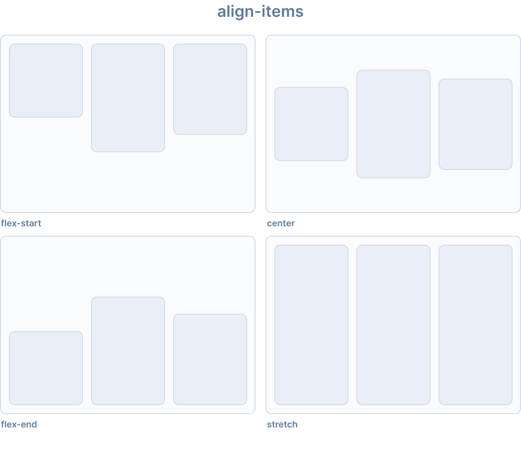
Ionic 为 align-items 提供了以下实用类:
🌐 Ionic provides the following utility classes for align-items:
| 类 | 样式规则 | 描述 |
|---|---|---|
.ion-align-items-start | align-items: flex-start | 项目沿交叉轴向起点对齐 |
.ion-align-items-end | align-items: flex-end | 项目沿交叉轴向终点对齐 |
.ion-align-items-center | align-items: center | 项目沿交叉轴居中 |
.ion-align-items-baseline | align-items: baseline | 项目对齐以使基线对齐 |
.ion-align-items-stretch | align-items: stretch | 项目被拉伸以填充容器 |
内容对齐
🌐 Align Content
align-content CSS 属性设置沿 flexbox 的交叉轴,或网格或块级元素的块轴,内容项之间和周围的空间分布。
🌐 The align-content CSS property sets the distribution of space between and around content items along a flexbox's cross axis, or a grid or block-level element's block axis.
此属性对单行弹性容器无效(即带有 flex-wrap: nowrap 的容器)。
🌐 This property has no effect on single line flex containers (i.e., ones with flex-wrap: nowrap).
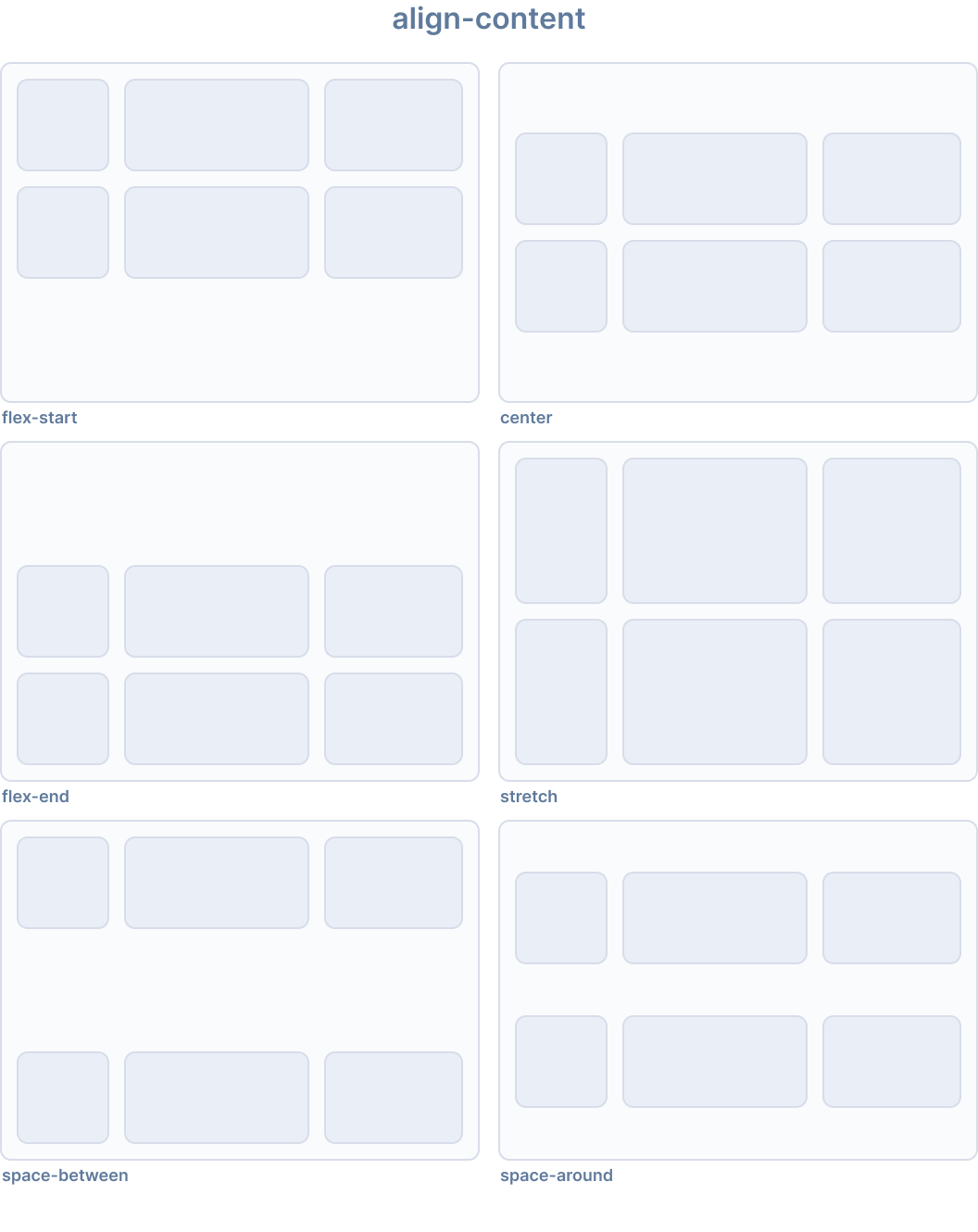
Ionic 为 align-content 提供了以下实用类:
🌐 Ionic provides the following utility classes for align-content:
| 类别 | 样式规则 | 描述 |
|---|---|---|
.ion-align-content-start | align-content: flex-start | 行沿交叉轴靠起始端排列。 |
.ion-align-content-end | align-content: flex-end | 行沿交叉轴靠结束端排列。 |
.ion-align-content-center | align-content: center | 行沿交叉轴居中排列。 |
.ion-align-content-stretch | align-content: stretch | 行拉伸以填充容器。 |
.ion-align-content-between | align-content: space-between | 行在交叉轴上均匀分布。 |
.ion-align-content-around | align-content: space-around | 行在交叉轴上均匀分布且周围间距相等。 |
内容对齐
🌐 Justify Content
justify-content CSS 属性定义了浏览器如何在弹性容器的主轴以及网格和多列容器的行内轴上分配内容项之间和周围的空间。
🌐 The justify-content CSS property defines how the browser distributes space between and around content items along the main axis of a flex container and the inline axis of grid and multi-column containers.
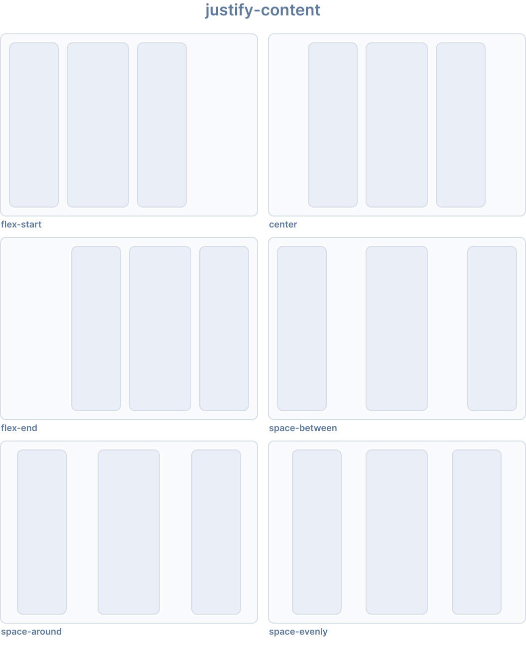
Ionic 为 justify-content 提供了以下实用类:
🌐 Ionic provides the following utility classes for justify-content:
| 类 | 样式规则 | 描述 |
|---|---|---|
.ion-justify-content-start | justify-content: flex-start | 项目沿主轴向起始端排列。 |
.ion-justify-content-end | justify-content: flex-end | 项目沿主轴向末端排列。 |
.ion-justify-content-center | justify-content: center | 项目沿主轴居中排列。 |
.ion-justify-content-around | justify-content: space-around | 项目沿主轴均匀分布,周围间距相等�。 |
.ion-justify-content-between | justify-content: space-between | 项目沿主轴均匀分布。 |
.ion-justify-content-evenly | justify-content: space-evenly | 项目分布使任何两个项目之间的间距相等。 |
弹性方向
🌐 Flex Direction
flex-direction CSS 属性设置弹性容器中弹性项目的放置方式,定义主轴及方向(正常或反向)。
🌐 The flex-direction CSS property sets how flex items are placed in the flex container defining the main axis and the direction (normal or reversed).
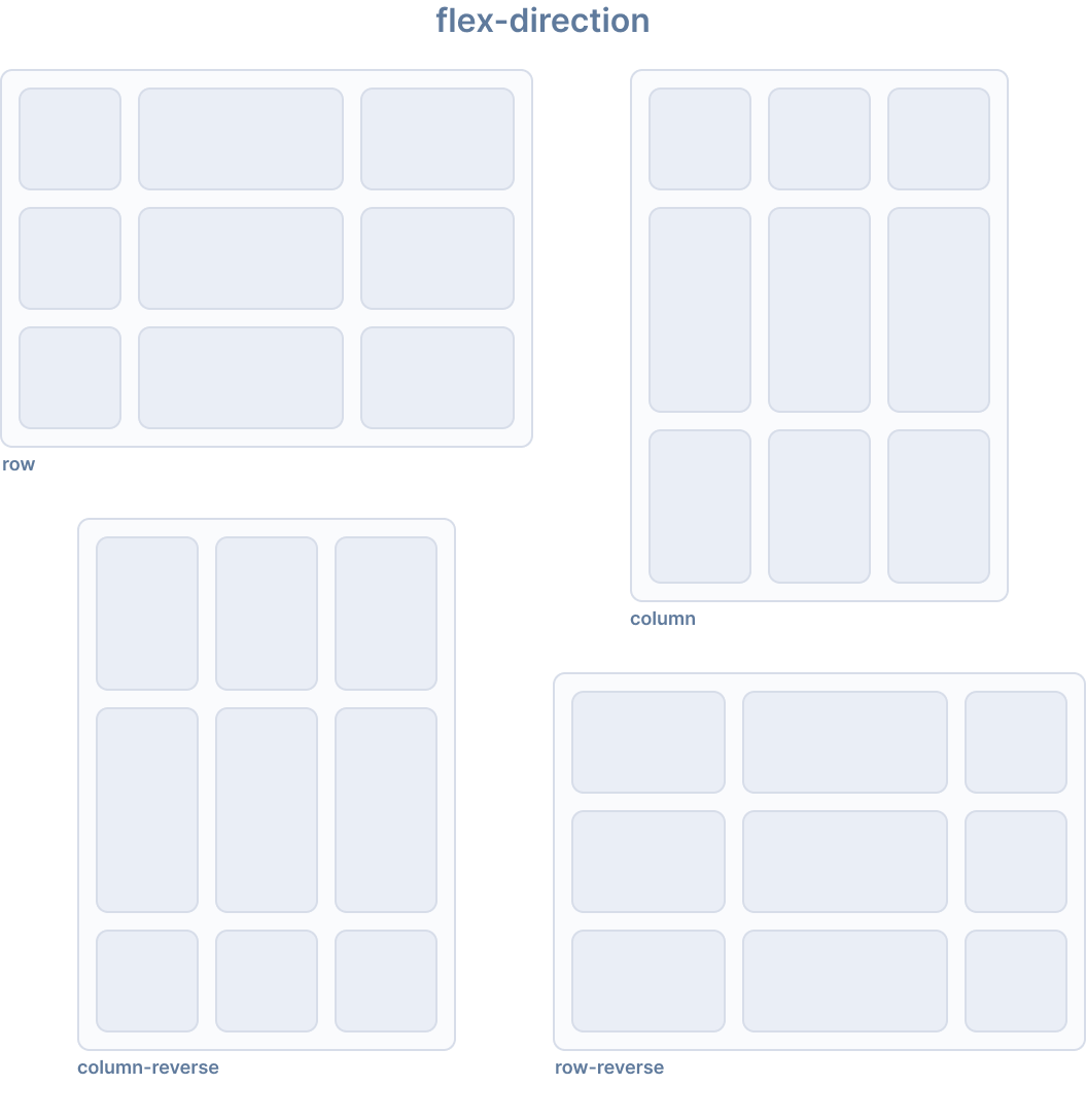
Ionic 为 flex-direction 提供了以下实用类:
🌐 Ionic provides the following utility classes for flex-direction:
| 类别 | 样式规则 | 描述 |
|---|---|---|
.ion-flex-row | flex-direction: row | 项目与文本方向相同。 |
.ion-flex-row-reverse | flex-direction: row-reverse | 项目与文本方向相反。 |
.ion-flex-column | flex-direction: column | 项目垂直排列。 |
.ion-flex-column-reverse | flex-direction: column-reverse | 项目垂直反向排列。 |
弹性封装
🌐 Flex Wrap
flex-wrap CSS 属性设置是否强制将 flex 项目放在一行上,或者可以换行到多行。如果允许换行,它会设置行叠放的方向。
🌐 The flex-wrap CSS property sets whether flex items are forced onto one line or can wrap onto multiple lines. If wrapping is allowed, it sets the direction that lines are stacked.
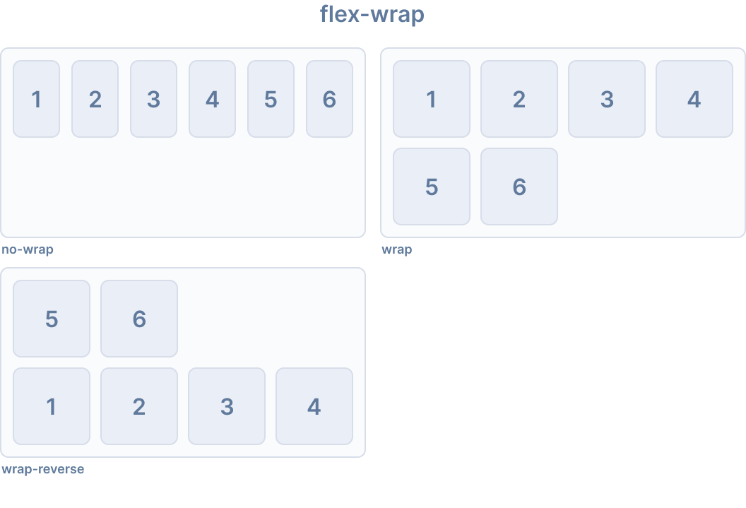
Ionic 为 flex-wrap 提供了以下实用类:
🌐 Ionic provides the following utility classes for flex-wrap:
| 类别 | 样式规则 | 描述 |
|---|---|---|
.ion-flex-nowrap | flex-wrap: nowrap | 项目将全部显示在一行上。 |
.ion-flex-wrap | flex-wrap: wrap | 项目将换行显示,从上到下。 |
.ion-flex-wrap-reverse | flex-wrap: wrap-reverse | 项目将换行显示,从下到上。 |
响应式 Flex 容器类
🌐 Responsive Flex Container Classes
上面列出的所有弹性容器类都有额外的类来根据屏幕尺寸修改属性。不要使用基本类名,而是使用 {property}-{breakpoint}-{modifier} 来仅在特定屏幕尺寸上使用该类,其中 {breakpoint} 是 Ionic 断点 中列出的断点名称之一。
🌐 All of the flex container classes listed above have additional classes to modify the properties based on the screen size. Instead of the base class name, use {property}-{breakpoint}-{modifier} to only use the class on specific screen sizes, where {breakpoint} is one of the breakpoint names listed in Ionic Breakpoints.
下表显示了默认行为,其中 {property} 是以下之一:justify-content、align-content、align-items、flex 或 flex-wrap,而 {modifier} 是上述所述的对应值。
🌐 The table below shows the default behavior, where {property} is one of the following: justify-content, align-content, align-items, flex, or flex-wrap, and {modifier} is the corresponding value as described above.
| 类别 | 描述 |
|---|---|
.ion-{property}-{modifier} | 在所有屏幕尺寸上将修饰符应用于元素。 |
.ion-{property}-sm-{modifier} | 当 min-width: 576px 时将修饰符应用于元素。 |
.ion-{property}-md-{modifier} | 当 min-width: 768px 时将修饰符应用于元素。 |
.ion-{property}-lg-{modifier} | 当 min-width: 992px 时将修饰符应用于元素。 |
.ion-{property}-xl-{modifier} | 当 min-width: 1200px 时将修饰符应用于元素。 |
已弃�用的类
🌐 Deprecated Classes
以下类已被弃用,并将在下一个主要版本中移除。请改用推荐的 .ion-flex-* 类。
🌐 The following classes are deprecated and will be removed in the next major release. Use the recommended .ion-flex-* classes instead.
| 类别 | 描述 |
|---|---|
.ion-nowrap | 项目将全部显示在一行上。 已弃用 — 请改用 .ion-flex-nowrap。 |
.ion-wrap | 项目将换行显示,从上到下。 已弃用 — 请改用 .ion-flex-wrap。 |
.ion-wrap-reverse | 项目将换行显示,从下到上。 已弃用 — 请改用 .ion-flex-wrap-reverse。 |
弹性条目属性
🌐 Flex Item Properties
弹性子项属性控制各个弹性子项在其弹性容器中的行为。另请参见:弹性容器属性 以了解容器级对齐方式。
🌐 Flex item properties control how individual flex items behave within their flex container. See also: Flex Container Properties for container-level alignment.
自身对齐
🌐 Align Self
align-self CSS 属性会覆盖网格或弹性盒子项目的 align-items 值。在网格布局中,它用于在网格区域内对齐项目。在弹性盒子中,它用于在交叉轴上对齐项目。
🌐 The align-self CSS property overrides a grid or flex item's align-items value. In grid, it aligns the item inside the grid area. In flexbox, it aligns the item on the cross axis.
该属性不适用于块级盒子或表格单元格。如果一个弹性盒子项目的交叉轴外边距是 auto,那么 align-self 会被忽略。
🌐 The property doesn't apply to block-level boxes, or to table cells. If a flexbox item's cross-axis margin is auto, then align-self is ignored.
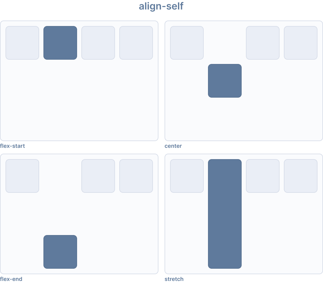
Ionic 为 align-self 提供了以下实用类:
🌐 Ionic provides the following utility classes for align-self:
| 类 | 样式规则 | 描述 |
|---|---|---|
.ion-align-self-start | align-self: flex-start | 项目在交叉轴的开始方向对齐。 |
.ion-align-self-end | align-self: flex-end | 项目在交叉轴的结束方向对齐。 |
.ion-align-self-center | align-self: center | 项目在交叉轴上居中。 |
.ion-align-self-baseline | align-self: baseline | 项目对齐,使其基线与其他项目基线对齐。 |
.ion-align-self-stretch | align-self: stretch | 项目被拉伸以填充容器。 |
.ion-align-self-auto | align-self: auto | 项目根据父元素的 align-items 值定位。 |
弹性
🌐 Flex
flex CSS 属性是 flex-grow、flex-shrink 和 flex-basis 的简写属性。它设置了 flex 项目如何在其 flex 容器中根据可用空间进行增长或缩小。
🌐 The flex CSS property is a shorthand property for flex-grow, flex-shrink and flex-basis. It sets how a flex item will grow or shrink to fit the space available in its flex container.
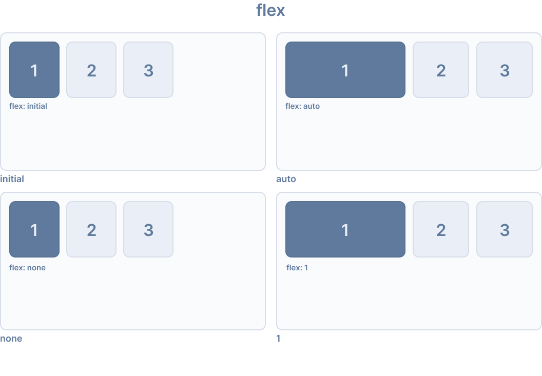
Ionic 为 flex 提供了以下实用类:
🌐 Ionic provides the following utility classes for flex:
| 类 | 样式规则 | 描述 |
|---|---|---|
.ion-flex-1 | flex: 1 | 项目与其他弹性项目一样同比例地增长和缩小。 |
.ion-flex-auto | flex: auto | 项目根据其内容大小进行增长和缩小。 |
.ion-flex-initial | flex: initial | 项目缩小到其最小内容大小,但不增长。 |
.ion-flex-none | flex: none | 项目既不增长也不缩小。 |
弹性增长
🌐 Flex Grow
flex-grow CSS 属性设置弹性增长因子,它指定弹性容器的正自由空间(如果有的话)应分配给弹性项目主尺寸的多少。
🌐 The flex-grow CSS property sets the flex grow factor, which specifies how much of the flex container's positive free space, if any, should be assigned to the flex item's main size.
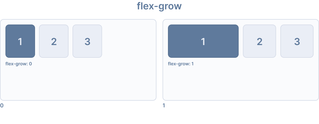
Ionic 为 flex-grow 提供了以下实用类:
🌐 Ionic provides the following utility classes for flex-grow:
| 类 | 样式规则 | 描述 |
|---|---|---|
.ion-flex-grow-0 | flex-grow: 0 | 项目不会超出其内容大小。 |
.ion-flex-grow-1 | flex-grow: 1 | 项目按比例增长以填充可用空间。 |
弹性收缩
🌐 Flex Shrink
flex-shrink CSS 属性设置弹性项目的收缩因子。如果所有弹性项目的大小都大于弹性容器,则弹性项目可以根据它们的 flex-shrink 值缩小以适应。每个弹性行的负自由空间会在该行的弹性项目之间分配,这些弹性项目的 flex-shrink 值大于 0。
🌐 The flex-shrink CSS property sets the flex shrink factor of a flex item. If the size of all flex items is larger than the flex container, the flex items can shrink to fit according to their flex-shrink value. Each flex line's negative free space is distributed between the line's flex items that have a flex-shrink value greater than 0.
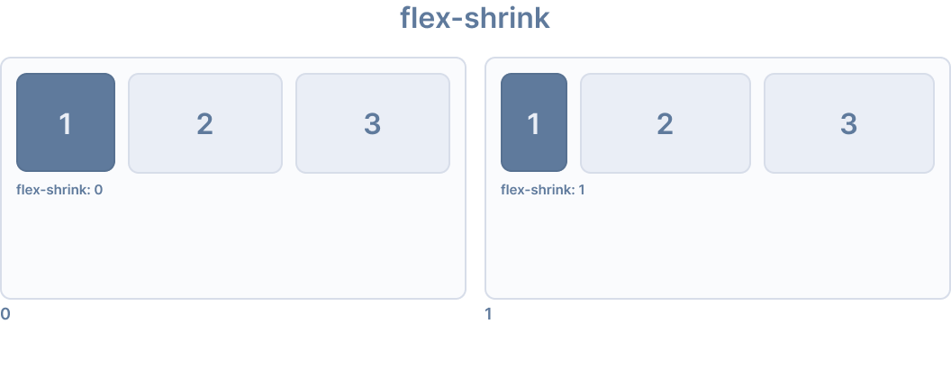
Ionic 为 flex-shrink 提供了以下实用类:
🌐 Ionic provides the following utility classes for flex-shrink:
| 类 | 样式规则 | 描述 |
|---|---|---|
.ion-flex-shrink-0 | flex-shrink: 0 | 项目不会缩小到小于其内容的大小。 |
.ion-flex-shrink-1 | flex-shrink: 1 | 当容器过小时,项目按比例缩小。 |
顺序
🌐 Order
order CSS 属性设置在 flex 或 grid 容器中排列项目的顺序。容器中的项�目按升序的 order 值排序,然后按其源代码顺序排序。未指定显式 order 值的项目将被分配默认值 0。
🌐 The order CSS property sets the order to lay out an item in a flex or grid container. Items in a container are sorted by ascending order value and then by their source code order. Items not given an explicit order value are assigned the default value of 0.
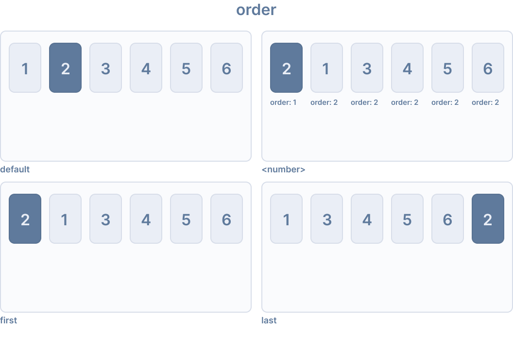
Ionic 为 order 提供了以下实用类:
🌐 Ionic provides the following utility classes for order:
| 类别 | 样式规则 | 描述 |
| --- | --- | --- |
| .ion-order-first | order: -1 | 项目首先出现在弹性容器中。 |
| .ion-order-0 | order: 0 | 物品按其自然顺序出现。 |
| .ion-order-1 | order: 1 | 该项出现在顺序为 0 的项目之后。 |
| .ion-order-2 | order: 2 | 该项出现在顺序为 1 的项目之后。 |
| .ion-order-3 | order: 3 | 该项出现在顺序为2的项之后。 |
| .ion-order-4 | order: 4 | 该项出现在顺序为3的项之后。 |
| .ion-order-5 | order: 5 | 该物品出现在顺序为4的物品之后。 |
| .ion-order-6 | order: 6 | 该物品出现在顺序为5的物品之后。 |
| .ion-order-7 | order: 7 | 该物品出现在顺序为6的物品之后。 |
| .ion-order-8 | order: 8 | 该物品出现在顺序为7的物品之后。 |
| .ion-order-9 | order: 9 | 该项出现在顺序为8的项之后。 |
| .ion-order-10 | order: 10 | 该物品出现在顺序为9的物品之后。 |
| .ion-order-11 | order: 11 | 该项出现在顺序为10的项之后。 |
| .ion-order-12 | order: 12 | 该项出现在顺序为11的项之后。 |
| .ion-order-last | order: 13 | 项目出现在弹性容器的最后。 |
响应式 Flex 项目类
🌐 Responsive Flex Item Classes
上面列出的所有弹性项目类都有额外的类,可根据屏幕尺寸修改属性。不要使用基本类名称,而是使用 {property}-{breakpoint}-{modifier} 仅在特定屏幕尺寸上使用该类,其中 {breakpoint} 是 Ionic Breakpoints 中列出的断点名称之一。
🌐 All of the flex item classes listed above have additional classes to modify the properties based on the screen size. Instead of the base class name, use {property}-{breakpoint}-{modifier} to only use the class on specific screen sizes, where {breakpoint} is one of the breakpoint names listed in Ionic Breakpoints.
下表显示了默认行为,其中 {property} 是以下之一:align-self、flex、flex-grow、flex-shrink 或 order,而 {modifier} 是上述所述的对应值。
🌐 The table below shows the default behavior, where {property} is one of the following: align-self, flex, flex-grow, flex-shrink, or order, and {modifier} is the corresponding value as described above.
| 类别 | 描述 |
|---|---|
.ion-{property}-{modifier} | 在所有屏幕尺寸上将修饰符应用于元素。 |
.ion-{property}-sm-{modifier} | 当 min-width: 576px 时将修饰符应用于元素。 |
.ion-{property}-md-{modifier} | 当 min-width: 768px 时将修饰符应用于元素。 |
.ion-{property}-lg-{modifier} | 当 min-width: 992px 时将修饰符应用于元素。 |
.ion-{property}-xl-{modifier} | 当 min-width: 1200px 时将修饰符应用于元素。 |
边框显示
🌐 Border Display
.ion-no-border 工具类可以用来移除 Ionic 组件的边框。该类可以应用于 ion-header 和 ion-footer 组件。
🌐 The .ion-no-border utility class can be used to remove borders from Ionic components. This class can be applied to the ion-header and ion-footer components.
<ion-header class="ion-no-border">
  <ion-toolbar>
    <ion-title>Header - No Border</ion-title>
  </ion-toolbar>
</ion-header>

<ion-footer class="ion-no-border">
  <ion-toolbar>
    <ion-title>Footer - No Border</ion-title>
  </ion-toolbar>
</ion-footer>
| 类别 | 描述 |
|---|---|
.ion-no-border | 该元素将没有边框。 |
Ionic 断点
🌐 Ionic Breakpoints
Ionic 在媒体查询中使用断点,以便根据屏幕尺寸对应用进行不同的样式设置。上述实用程序类中使用了以下断点名称,当满足宽度时,将应用对应的类。
🌐 Ionic uses breakpoints in media queries in order to style an application differently based on the screen size. The following breakpoint names are used in the utility classes listed above, where the class will apply when the width is met.
| 断点名称 | 宽度 |
|---|---|
xs | 0 |
sm | 576px |
md | 768px |
lg | 992px |
xl | 1200px |