跨平台
🌐 Cross Platform
Ionic 是从零开始构建的,旨在让开发变得轻松,无论你是为哪个平台开发。Ionic 应用是真正的跨平台:能够作为 Android、iOS、Electron 和渐进式网络应用(PWA)运行,所有这些都来自同一个代码库。在优化应用以跨这些平台运行时,需要注意一些要点。
🌐 Ionic is built from the ground up to make development easy, no matter what platform you are building for. Ionic apps are truly cross-platform: able to run as an Android, iOS, Electron, and Progressive Web App (PWA), all from a single codebase. There are some points to keep in mind when optimizing an app to work across these platforms.
硬件 API
🌐 Hardware APIs
在本地应用中,通常会进行 API 调用以与设备通信,例如打开相机��或访问地理位置。这些 API 调用在网页环境中无法使用,因为没有原生桥接。Ionic 处理此问题有几种方法。
🌐 In a native application, it's common to make API calls to communicate with the device, such as opening the camera or accessing geolocation. These API calls won’t work when called in a web environment because there’s no native bridge. There are a few ways Ionic handles this.
Ionic 原生
🌐 Ionic Native
Ionic Native 有自己的内部逻辑来检测它是否处于原生环境中。如果不是原生环境且没有可用的 Cordova 插件,它不会抛出运行时错误,而是会打印一个警告。应用不会崩溃,并且将继续工作,尽管没有原生功能。
平台检测
🌐 Platform Detection
在应用的逻辑中,每当需要调用本地 API 时,建议始终先检查本地环境的状态。例如:
🌐 In an app’s logic, whenever it is needed to make a native API call, it is recommended to always check the status of the native environment first. For example:
this.platform.ready().then(() => {
  // 'hybrid' detects both Cordova and Capacitor
  if (this.platform.is('hybrid')) {
    // make your native API calls
  } else {
    // fallback to browser APIs
  }
});
当针对无法确定对原生 API 的访问的环境时,这段代码非常有用。
🌐 This bit of code can be incredibly helpful when targeting environments where access to the native APIs is uncertain.
浏览器回退
🌐 Browser Fallbacks
许多人使用的原生 API(例如文件 API)在浏览器中不可用。这些 API 正在不断改进并赶上原生功能,因此建议对它们进行研究。考虑前两点因素后,为应用运行的平台创建一个适应性的良好体验相对容易。
🌐 Many native APIs that people use (for example, the File API), are not available in the browser. The APIs are always improving and catching up to native, so it is recommended to research them. Taking the first two points into consideration, it's fairly easy to create a nice experience that will adapt for the platform the app is running on.
响��应式用户界面
🌐 Responsive UI
当计划部署可在多种设备上使用的应用时,确保应用在更大的屏幕尺寸上顺利运行非常重要。
🌐 When planning to deploy an app that may be used across a variety of devices, it is important to ensure the app works smoothly on larger screen sizes.
布局
🌐 Layout
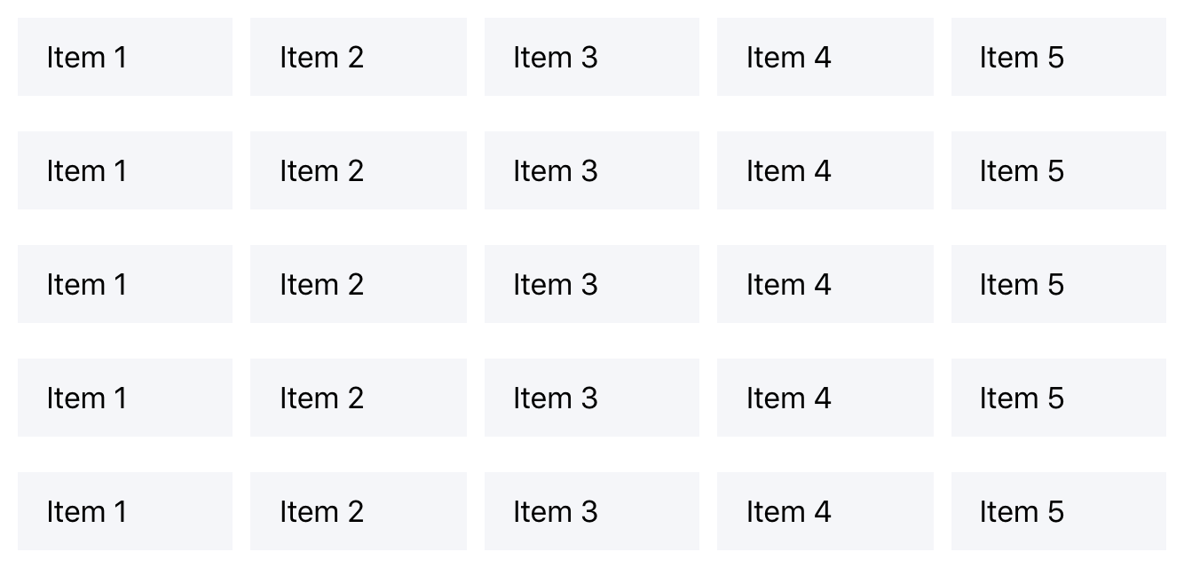
许多人很少注意应用的布局,但它可能对体验和可用性产生巨大影响。考虑这个常见的用户界面模式:
🌐 Many people rarely notice the layout of an app, but it can have a massive impact on experience and usability. Consider this common UI pattern:
<ion-content>
  <ion-item>
    <ion-label>Item 1</ion-label>
  </ion-item>
  <ion-item>
    <ion-label>Item 2</ion-label>
  </ion-item>
  <ion-item>
    <ion-label>Item 3</ion-label>
  </ion-item>
  <ion-item>
    <ion-label>Item 4</ion-label>
  </ion-item>
  <ion-item>
    <ion-label>Item 5</ion-label>
  </ion-item>
</ion-content>
这将渲染 5 个每个宽度为 100% 的项目。这在手机上看起来可能很棒,但在更大的屏幕上查看情况就不同了。由于屏幕宽度较大,项目会被拉伸以填满整个屏幕,从而导致屏幕空间未被使用。
🌐 This will render 5 items with a width of 100% each. This may look great on a phone, but viewing this on a larger screen is a different story. The items become stretched to fill the entire screen because of the wide screen width, leaving screen space unused.

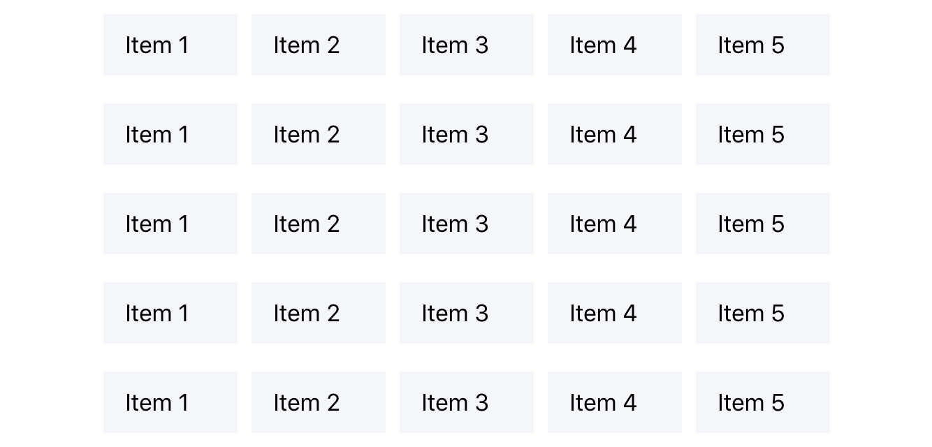
为了改善这种体验,我们可以将项目封装在一个 Grid 组件中。该视图可以很容易地重写为在较大屏幕上更易用的版本:
🌐 To improve this experience, we can wrap the items in a Grid component. The view can be easily rewritten into something more usable on larger screens:
<ion-grid>
  <ion-row>
    <ion-col>
      <ion-item>
        <ion-label>Item 1</ion-label>
      </ion-item>
    </ion-col>
    <ion-col>
      <ion-item>
        <ion-label>Item 2</ion-label>
      </ion-item>
    </ion-col>
    <ion-col>
      <ion-item>
        <ion-label>Item 3</ion-label>
      </ion-item>
    </ion-col>
    <ion-col>
      <ion-item>
        <ion-label>Item 4</ion-label>
      </ion-item>
    </ion-col>
    <ion-col>
      <ion-item>
        <ion-label>Item 5</ion-label>
      </ion-item>
    </ion-col>
  </ion-row>
</ion-grid>
通过将项目封装在 ion-grid 元素中,Ionic 网格系统被添加到我们的��布局中。将每个项目封装在列中,使得这些项目在同一行的网格内占据等宽。
🌐 By wrapping the items in an ion-grid element, the Ionic grid system is added to our layout. Wrapping each item in a column makes the items take up equal-width inside of the grid, along the same row.
我们可以通过向 <ion-grid> 元素添加 fixed 属性来进一步实现。这会告诉网格根据屏幕大小保持固定宽度。这对于较大的屏幕非常完美,因为当网格上没有宽度时,项目会开始再次拉伸。
🌐 We can take this even further by adding the fixed attribute to the <ion-grid> element. This tells the grid to have a fixed width based on the screen size. This is perfect for larger screens when items will begin to stretch again without a width on the grid.
通过添加 ion-col 属性,可以进一步自定义网格以更改列的尺寸。
🌐 The grid can be further customized to change the sizes of columns with the addition of the ion-col properties.
<ion-grid fixed>
  <ion-row>
    <ion-col size="12" size-sm="9" size-md="6" size-lg="4" size-xl="3">
      <ion-item>
        <ion-label>Item 1</ion-label>
      </ion-item>
    </ion-col>
    <ion-col size="12" size-sm="9" size-md="6" size-lg="4" size-xl="3">
      <ion-item>
        <ion-label>Item 2</ion-label>
      </ion-item>
    </ion-col>
    <ion-col size="12" size-sm="9" size-md="6" size-lg="4" size-xl="3">
      <ion-item>
        <ion-label>Item 3</ion-label>
      </ion-item>
    </ion-col>
    <ion-col size="12" size-sm="9" size-md="6" size-lg="4" size-xl="3">
      <ion-item>
        <ion-label>Item 4</ion-label>
      </ion-item>
    </ion-col>
    <ion-col size="12" size-sm="9" size-md="6" size-lg="4" size-xl="3">
      <ion-item>
        <ion-label>Item 5</ion-label>
      </ion-item>
    </ion-col>
  </ion-row>
</ion-grid>
上面的例子中发生了很多事情。以下是关键点:
🌐 There’s a lot going on in the example above. These are the key points:
ion-col的宽度由添加到它的size属性决定,其中 size 的值是占用的总列数中的列数。默认的可用列数是 12。size属性可以添加一个断点,size-{breakpoint}。此值设置指定断点及以上的大小。
有关使用网格进行自定义的更多信息,请参阅 Grid 文档。
🌐 For more information on customizing with grid, see the Grid documentation.
存储
🌐 Storage
大多数应用在某个阶段都需要在本地存储某种数据。无论是存储来自 XHR 请求的 JSON,还是保存认证令牌,都有许多不同的存储选项可用。更重要的是,如果应用运行在原生环境中,可以创建完整的 SQLite 数据库并在那里存储数据。所有这些不同的存储机制都有各自的优缺点,但 Ionic 开发者不必为此担心。
🌐 Most apps at some point will need to store some sort of data locally. Whether it’s storing some JSON from an XHR request, or saving an auth token, there are many different storage options available. On top of this, if the app is running in a native environment, it is possible to create a full SQLite database and store data there. All of these different storage mechanisms have their own advantages and disadvantages, but Ionic developers should not have to worry about that.
Ionic 存储
🌐 Ionic Storage
在这种情况下, Ionic 的 Storage 库 是多环境使用场景的完美选择。基于经过充分测试的 LocalForage 库构建,Ionic 的存储类提供了一种可适应的存储机制,可以为当前运行时选择最佳的存储解决方案。
目前,这意味着它将通过原生的 SQLite、IndexedDB(如果可用)、WebSql 或本地存储运行。通过处理所有这些,它允许使用稳定的 API 进行存储写入。
🌐 Currently this means it will run through SQLite for native, IndexedDB (if available), WebSql, or Local Storage. By handling all of this, it allows writing to storage using a stable API.
class MyClass {
  constructor(public storage: Storage) {}

  async setData(key, value) {
    const res = await this.storage.set(key, value);
    console.log(res);
  }

  async getData(key) {
    const keyVal = await this.storage.get(key);
    console.log('Key is', keyVal);
  }
}
还有其他存储解决方案,例如 PouchDB,它提供了类似的、适应性强的存储机制。
🌐 There are other storage solutions out there as well, such as PouchDB, which provide a similar, adaptable storage mechanism.