ion-item
项目是可以包含文本、图标、头像、图片、输入以及任何其他原生或自定义元素的元素。项目应仅作为列表中与其他项目一起的行使用。项目可以被滑动、删除、重新排序、编辑等。
🌐 Items are elements that can contain text, icons, avatars, images, inputs, and any other native or custom elements. Items should only be used as rows in a List with other items. Items can be swiped, deleted, reordered, edited, and more.
基本用法
🌐 Basic Usage
项目的文本左对齐,当文本宽于项目时会自动换行。我们可以使用 Ionic 框架提供的 CSS 工具类来修改此行为,例如�在下面的示例中使用 .ion-text-nowrap。更多可以应用于项目以改变文本的类,请参见 CSS 工具类文档。
🌐 Items left align text and wrap when the text is wider than the item. We can modify this behavior using the CSS Utilities provided by Ionic Framework, such as using .ion-text-nowrap in the below example. See the CSS Utilities Documentation for more classes that can be added to an item to transform the text.
内容类型
🌐 Content Types
虽然列表中的项目形式多样,但它们通常支持五种不同的内容类型:支持性视觉元素、文本、元数据、操作和控件。然而,并非所有这些内容类型都应该同时使用。以下指南展示了不同的内容类型以及如何在应用中正确使用它们。
🌐 While items in a list take many forms, they typically support 5 different content types: supporting visuals, text, metadata, actions, and controls. However, not all of these content types should be used together at the same time. The following guide shows the different content types as well as how to properly utilize them in an application.
支持视觉效果
🌐 Supporting Visuals
辅助视觉元素是用于项目的装饰性图标或其他装饰物。常见的辅助视觉元素示例有头像、图标和缩略图。由于这些内容对于理解项目的意图不是必需的,通常使用 aria-hidden="true" 将其从屏幕阅读器中隐藏。
🌐 Supporting visuals are decorative icons or other adornments for an item. Common examples of supporting visuals are Avatars, Icons, and Thumbnails. Since this content is not required to understand the intent of the item, it is typically hidden from screen readers using aria-hidden="true".
如果与该项目交互需要视觉元素,例如图标按钮,那么该视觉元素是一个操作,而不是辅助视觉元素。
🌐 If a visual is required to interact with the item, such as an icon button, then the visual is an action not a supporting visual.
Supporting visuals should be rendered in a consistent manner. This makes the information in each item easier to parse.
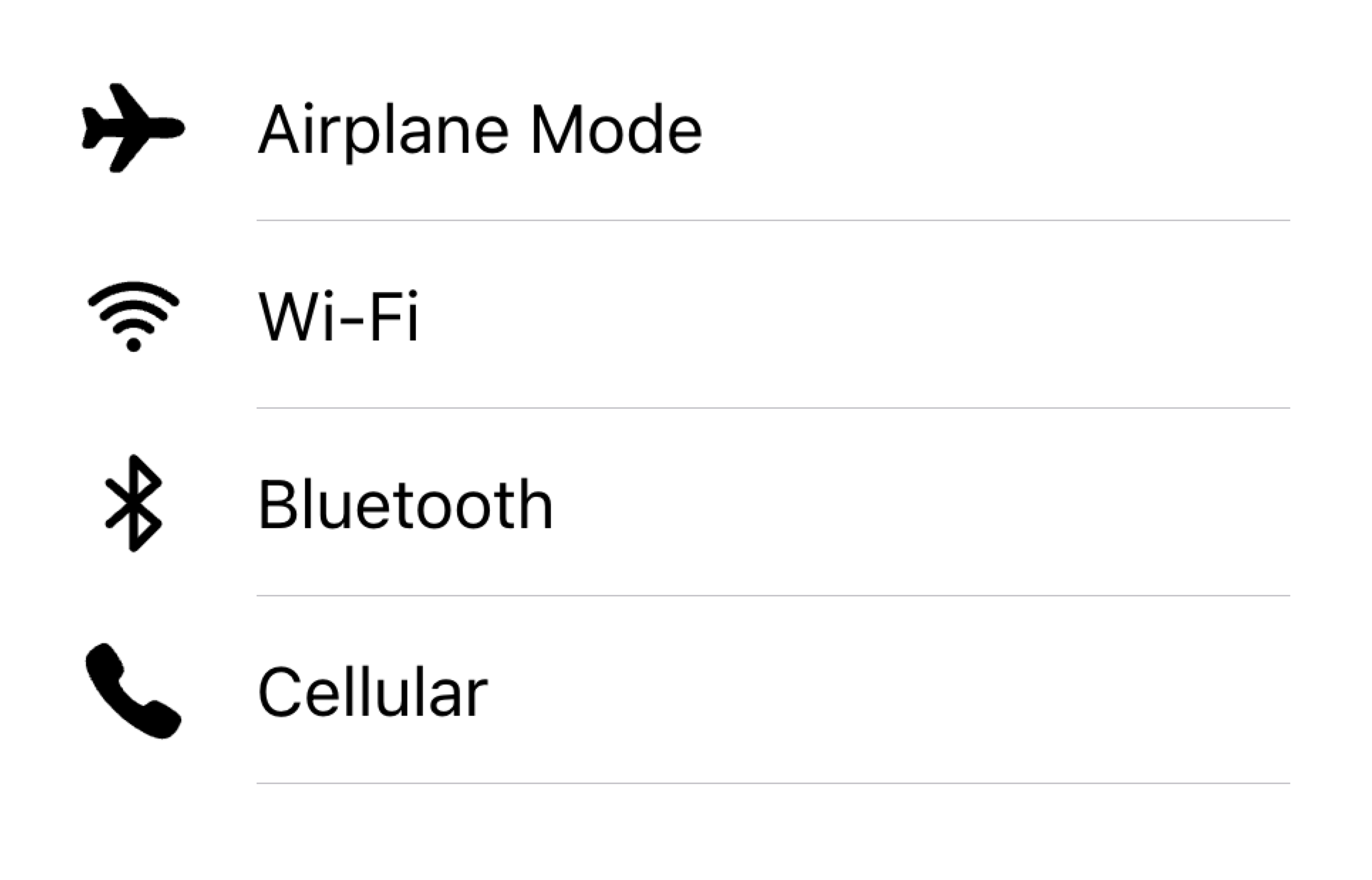
Align visuals on the same side in a list
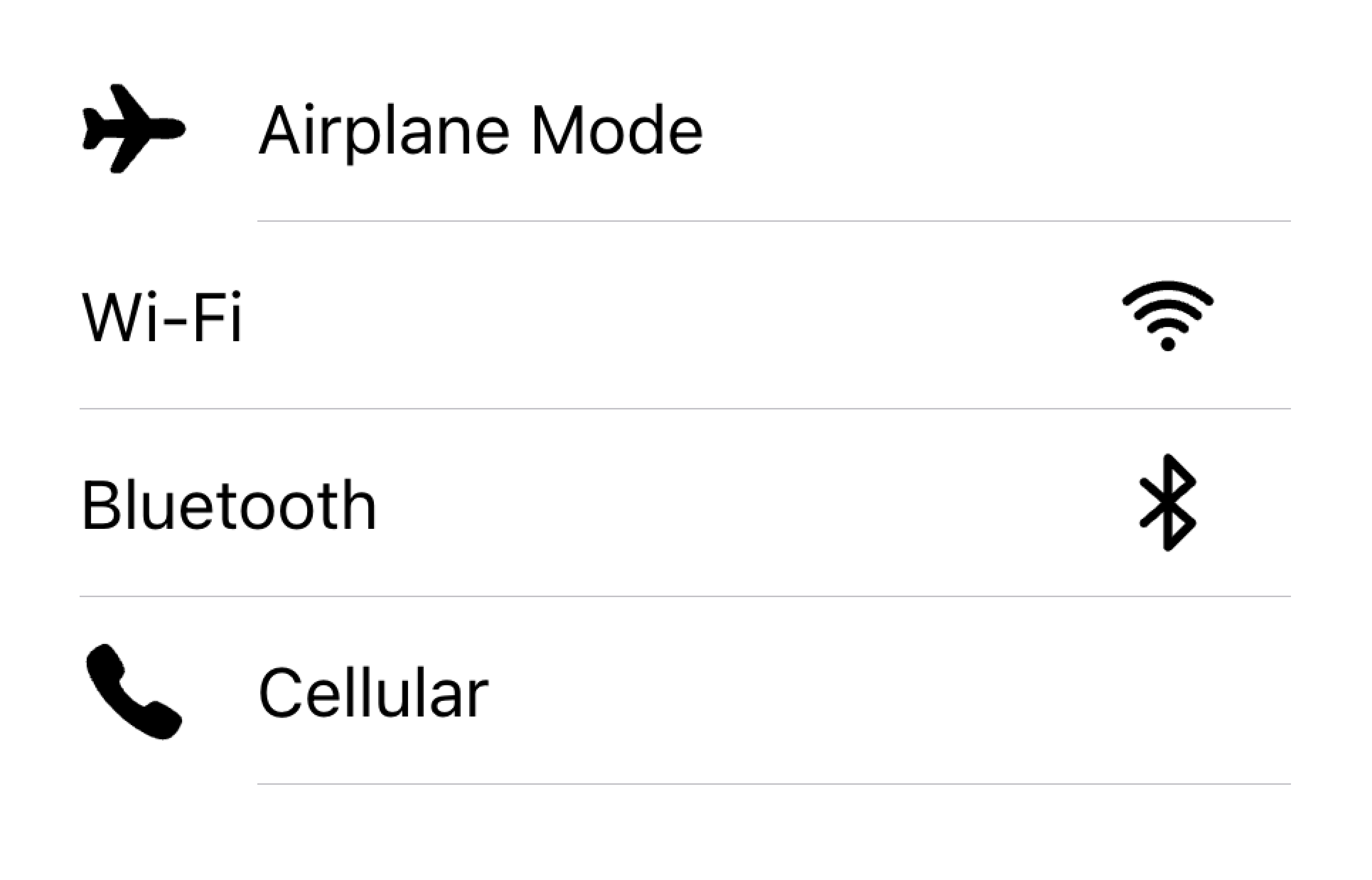
Don't render visuals with different alignments in the same list
在下面的示例中,我们正在创建两个带有辅助视觉效果的列表。第一个列表使用图标,第二个列表使用头像。视觉效果是装饰性的,因此它们都有 aria-hidden="true"。此外,它们在 start 插槽中渲染一致。
🌐 In the example below, we are creating two lists with supporting visuals. The first list uses icons, and the second list uses avatars. The visuals are decorative, so they all have aria-hidden="true". Additionally, they are presented consistently in the start slot.
文本
🌐 Text
文本内容类型包括表单控件标签或其他可见文本。这些文本用于指示项目的意图。尽量保持文本简短明了。
🌐 The text content type includes form control labels or other visible text. This text serves to indicate the intent of the item. Try to keep the text short and to the point.
If you find that you need a few more sentences to clarify the item's purpose, consider moving the additional sentences to a Note at the bottom of the list. Adding the item to its own list makes it clear which item the text is associated with.
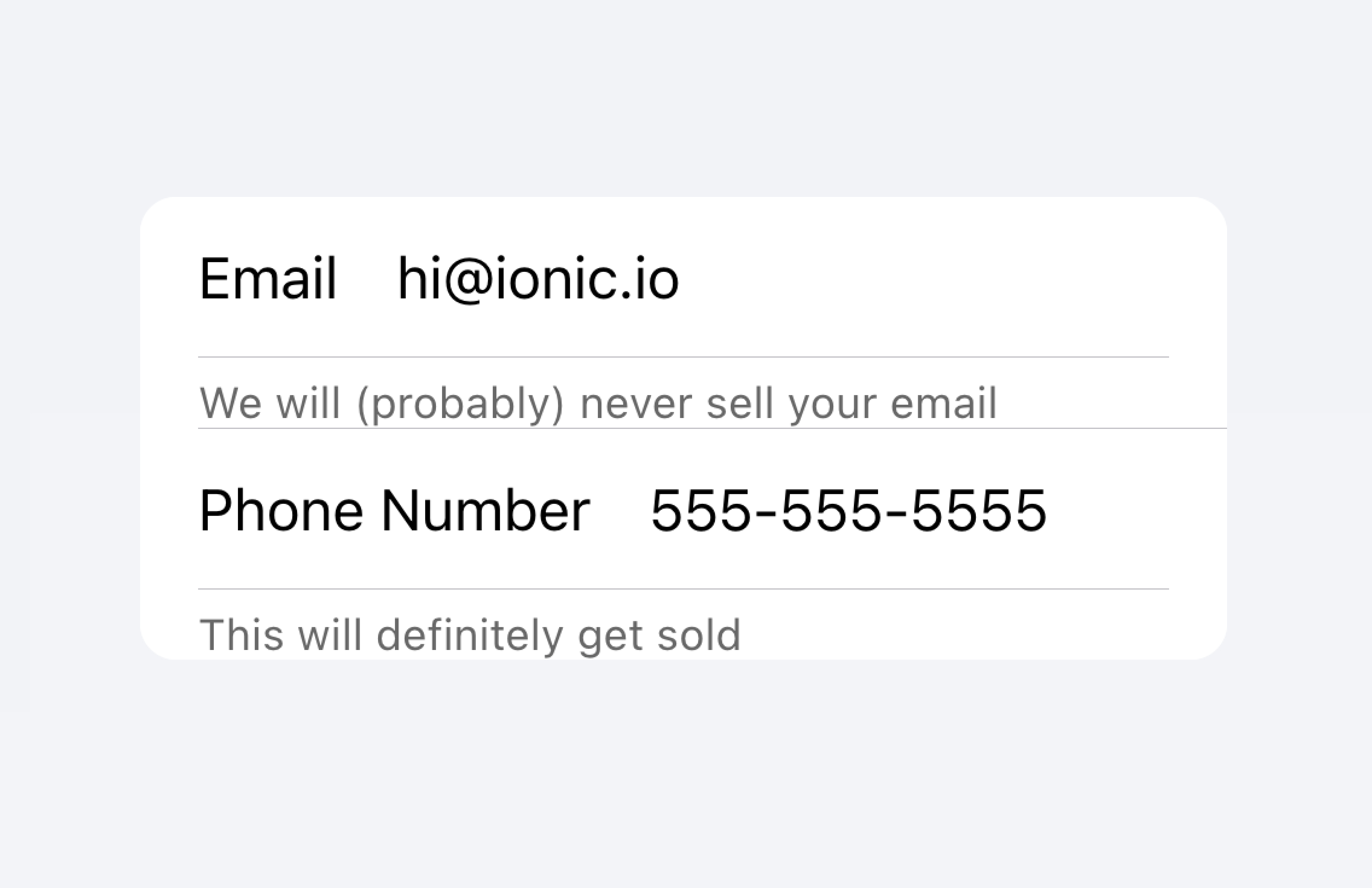
Move long text outside of the list
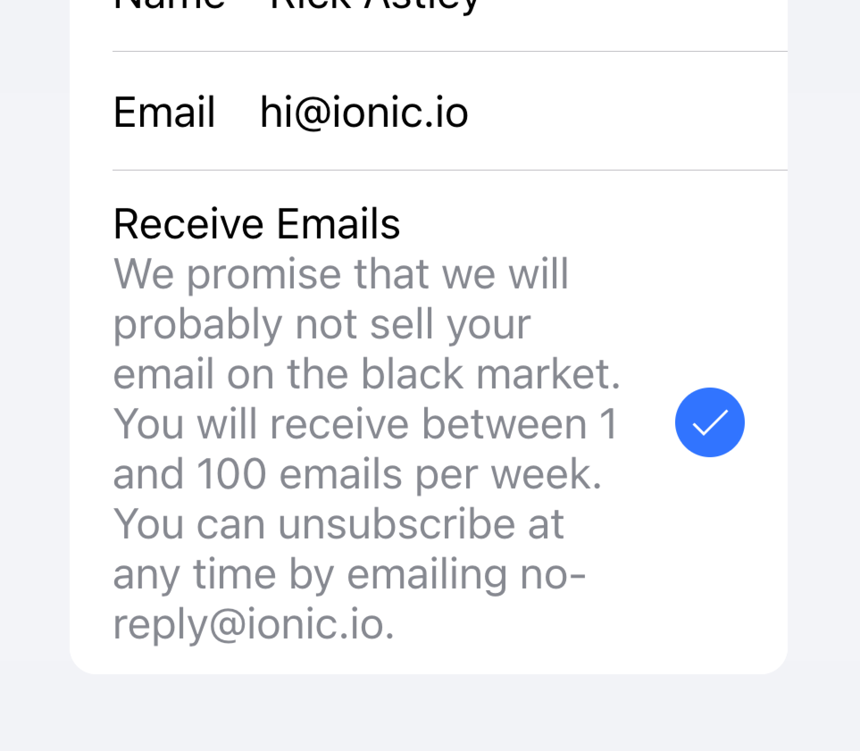
Don't try to fit long text in an item
在下面的示例中,我们正在创建一个包含不同类型文本的列表。“名字”和“姓氏”标签用于指示在文本输入框中输入什么内容。
🌐 In the example below, we are creating a list with different types of text. The "First Name" and "Last Name" labels serve to indicate what to type into the text inputs.
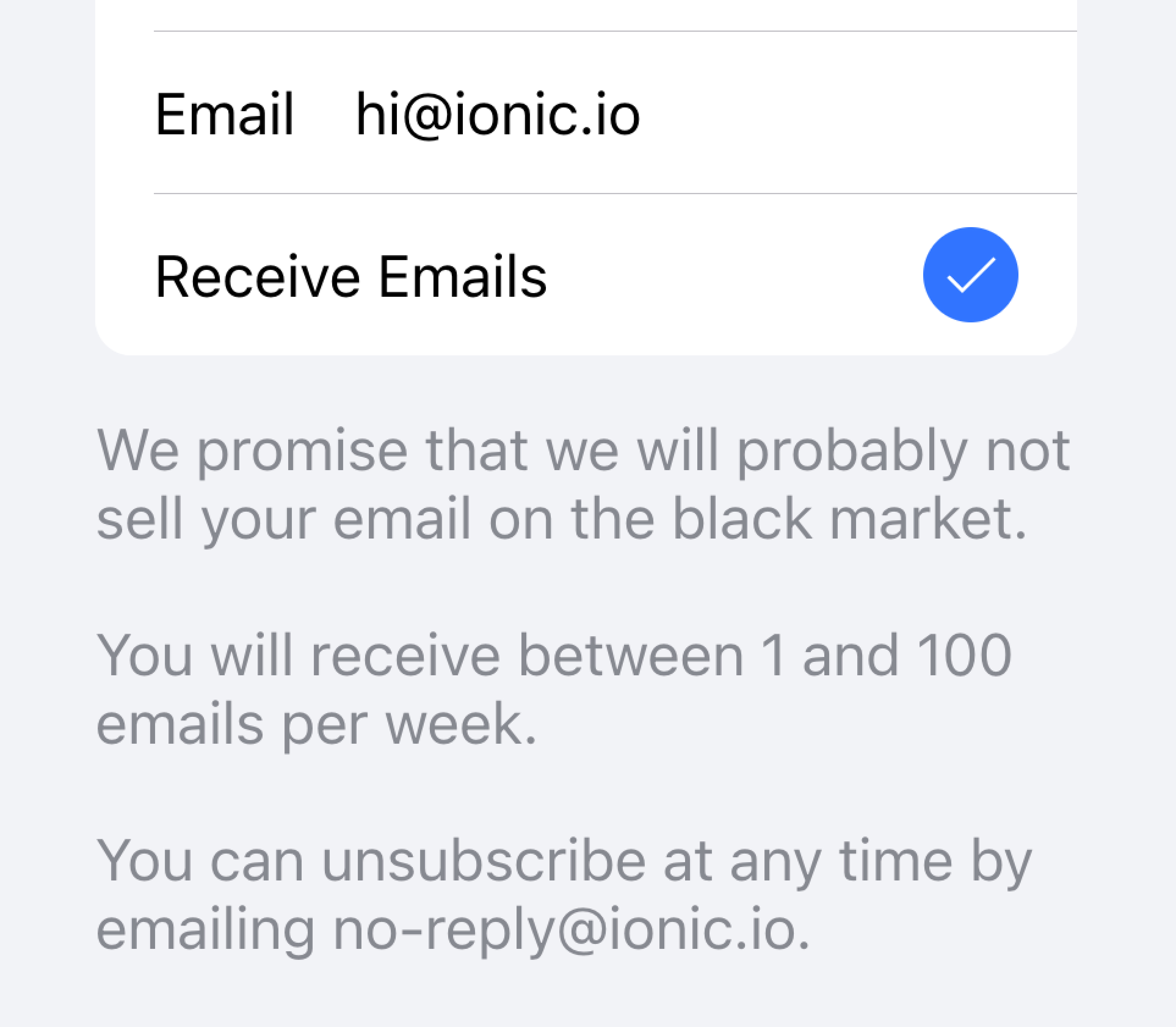
切换开关上的“允许通知”标签下面有额外的文字,说明用户可以关闭通知。由于这段文字很短,它被放置在项目内部。
🌐 The "Allow Notifications" label on the toggle has additional text underneath it that notes users can disable notifications. Since this text is short, it is placed inside of the item.
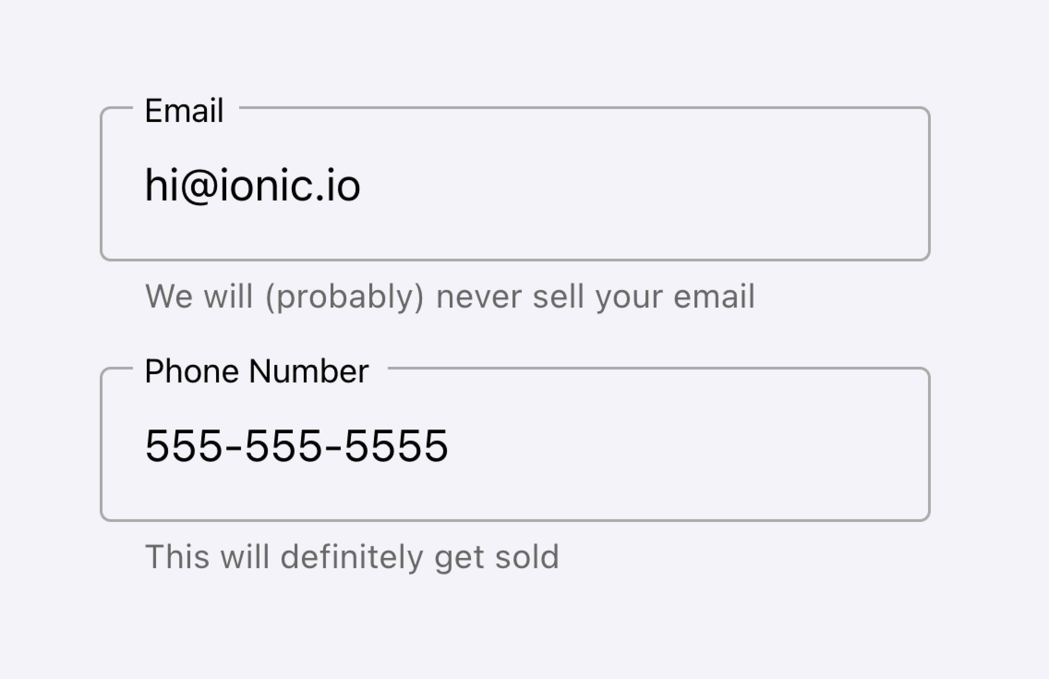
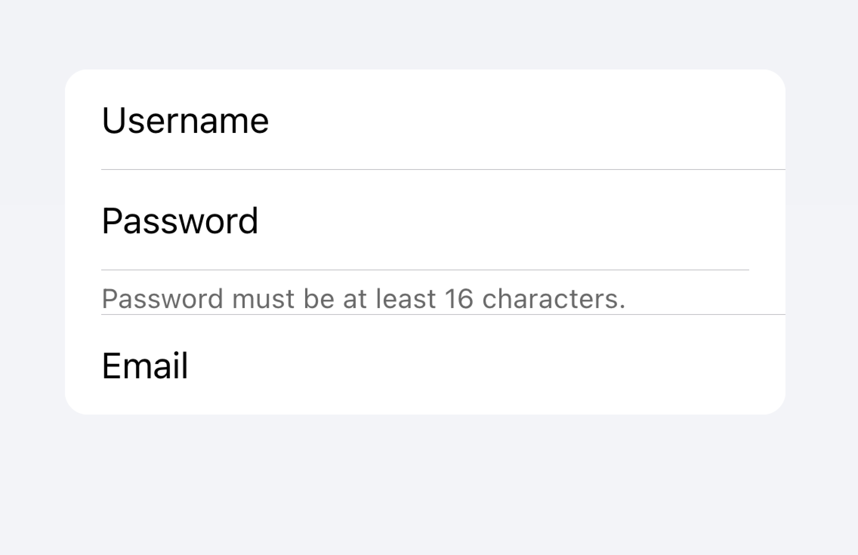
在该列表下方是另一个列表,其中包含一个带有注释的文本区域,下面有长文本。该文本区域被放置在自己的列表中,以便明确表示长文本与文本区域相关,而不是与其他字段相关。
🌐 Below that list is another list containing a textarea with a Note containing long text underneath. The textarea was placed in its own list to make it apparent that the long text is associated with the textarea and not any other fields.
元数据
🌐 Metadata
元数据为项目提供附加的上下文信息,例如状态文本或计数。像 Badge 或 Note 这样的组件是显示元数据的好方法。
🌐 Metadata provides additional context for an item such as status text or counts. Components like Badge or Note are great ways of showing metadata.
Limit the amount of metadata you include to only the most relevant information.
Add only the most important metadata
Don't add too much metadata as it can overwhelm or confuse the user.
Developers should also consider how important the metadata is. Drawing attention to the metadata may be helpful for the user or it may distract them from the more important information depending on the use case.
Prioritize the most important content.
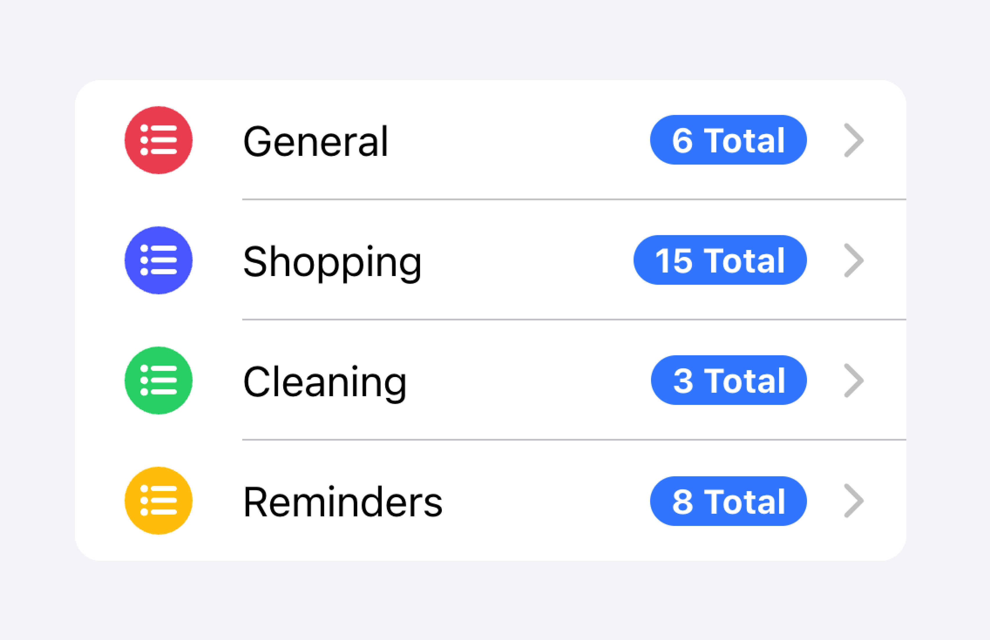
Prioritized metadata may distract from other important content.
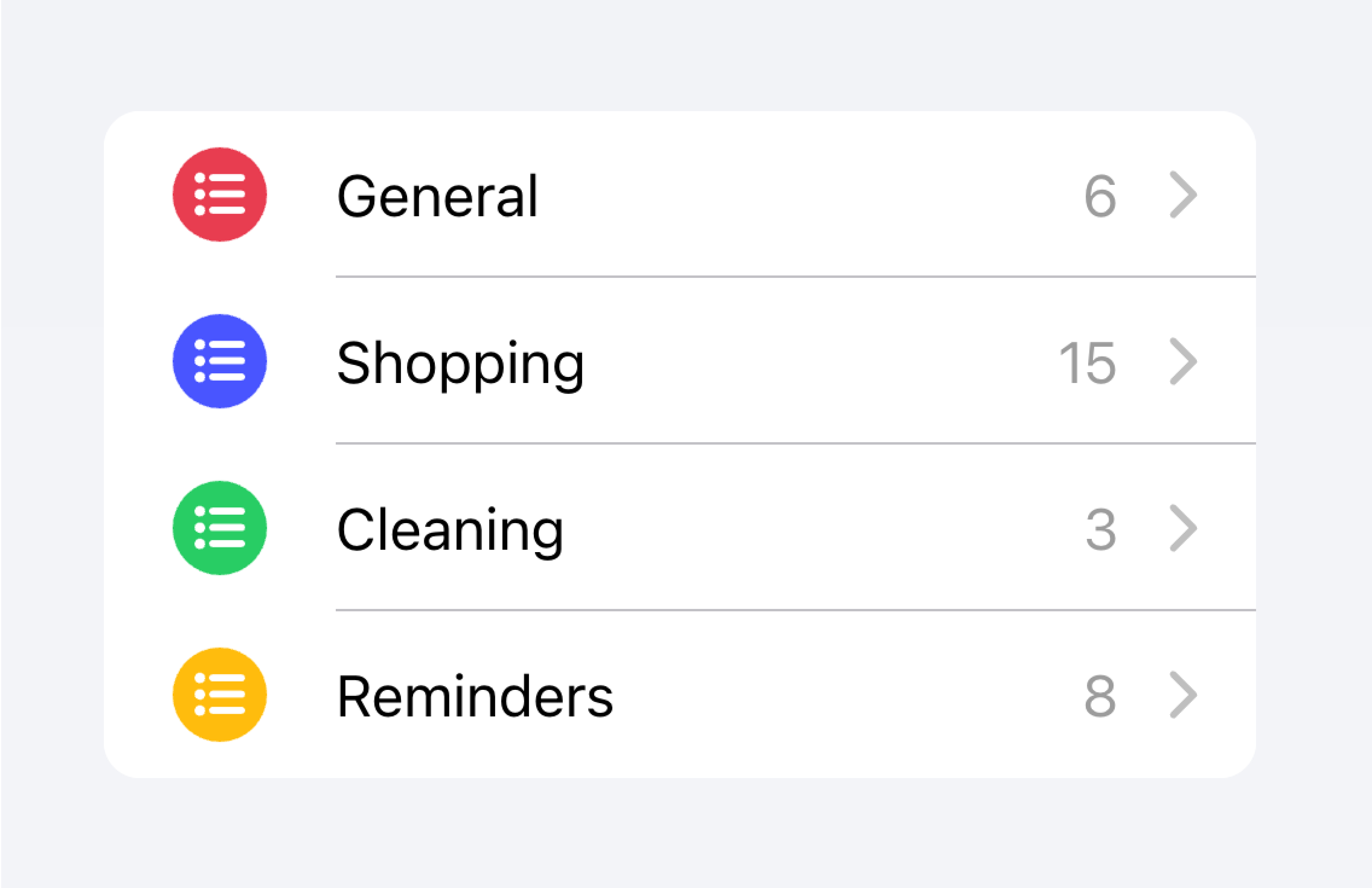
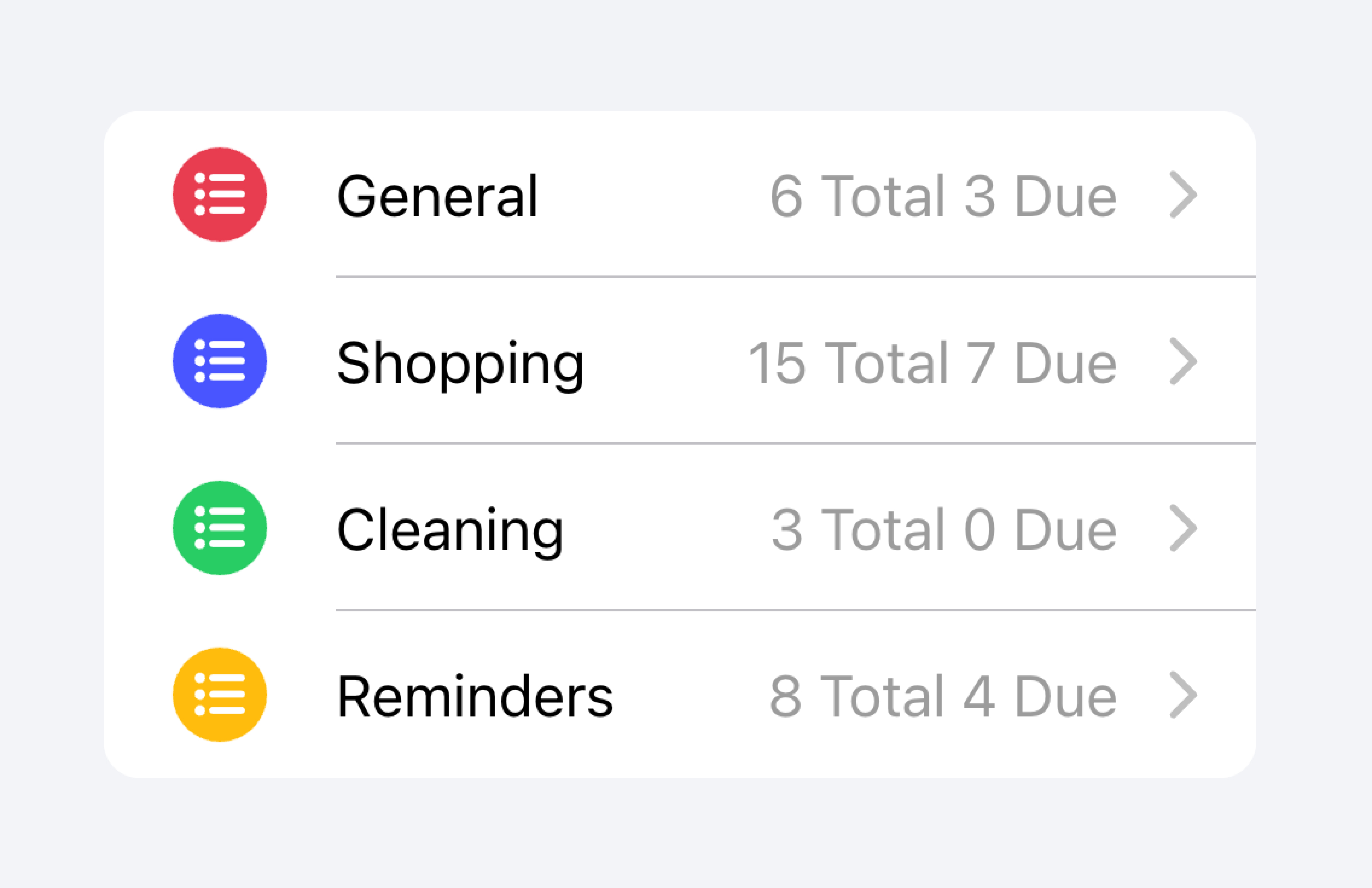
在下面的示例中,我们创建了两个包含不同类型元数据的列表。第一个列表使用 Note 来显示每个待办事项列表中有多少任务。
🌐 In the example below, we are creating two lists with different kinds of metadata. The first list uses Note to show how many tasks are in each to-do list.
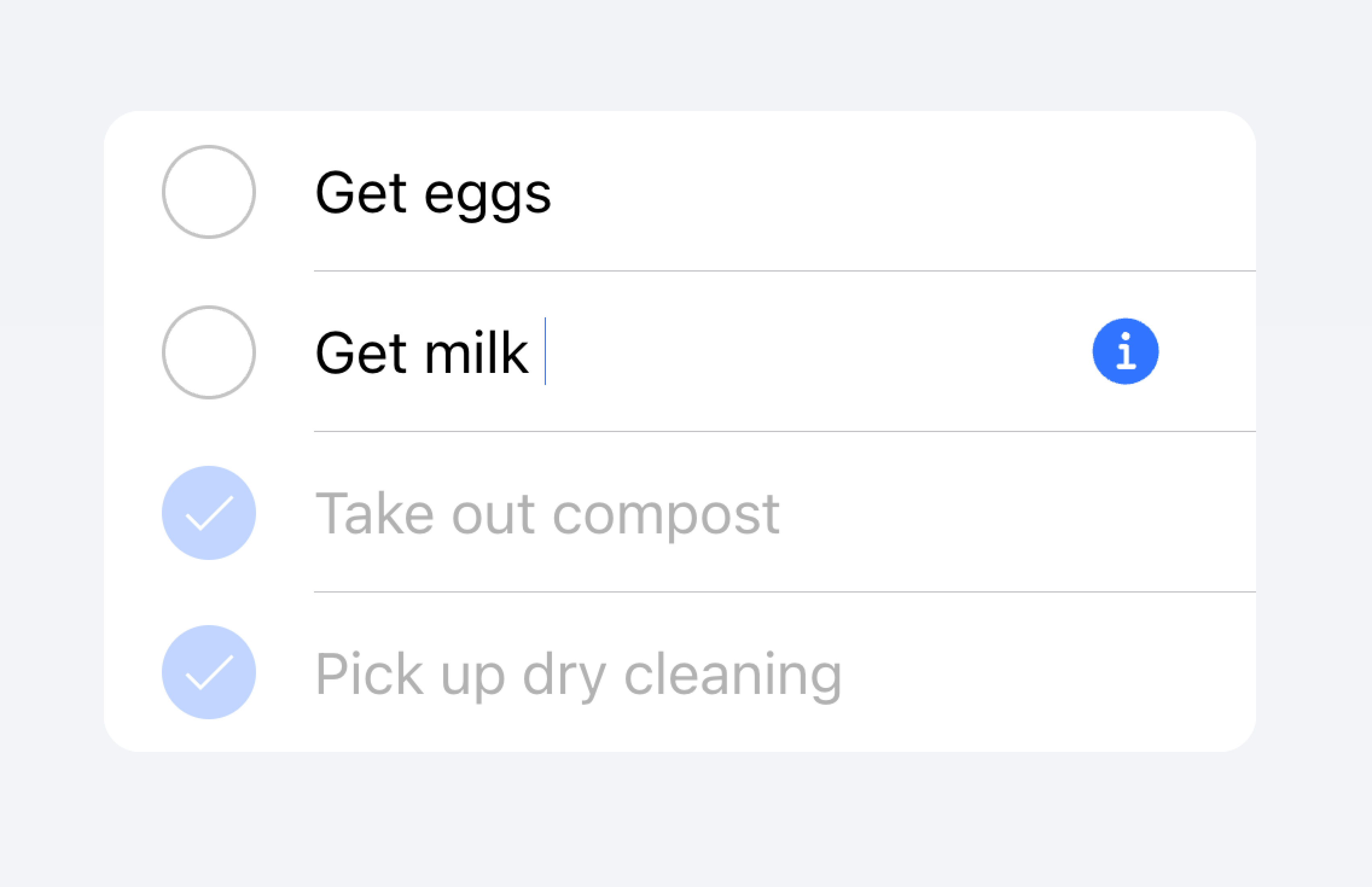
第二个列表模仿 iOS 邮件应用来显示收件箱。该列表使用了自定义元数据,包括在“start”位置的“未读消息”指示器,以及在“end”位置的时间戳和自定义详细图标。“未读消息”指示器以蓝色高亮,以吸引用户注意未读消息,而时间戳则更为低调。
🌐 The second list mimics the iOS Mail app to show an inbox. This list makes use of custom metadata including an "unread message" indicator in the "start" slot as well as a timestamp and custom detail icon in the "end" slot. The "unread message" indicator is highlighted in blue to draw the user's attention to the unread messages, while the timestamp is more subtle.
动作
🌐 Actions
操作是交互元素,当你激活它们时会执行某些操作。一个项目可以在一行上显示多个操作。然而,开发者应确保每个操作的点击区域足够大以便可用。
🌐 Actions are interactive elements that do something when you activate them. An item can have multiple actions displayed on a line. However, developers should ensure that each action's tap target is large enough to be usable.
开发者应避免创建 嵌套交互式组件 ,因为这可能会破坏屏幕阅读器的用户体验。例如,如果 button 属性设置为 true,开发者应避免在项目的主要内容中添加按钮。
Actions can be added by using the Item Sliding component. Actions can also be placed directly inside of the Item without the use of Item Sliding, but this should be limited to no more than 2 actions.
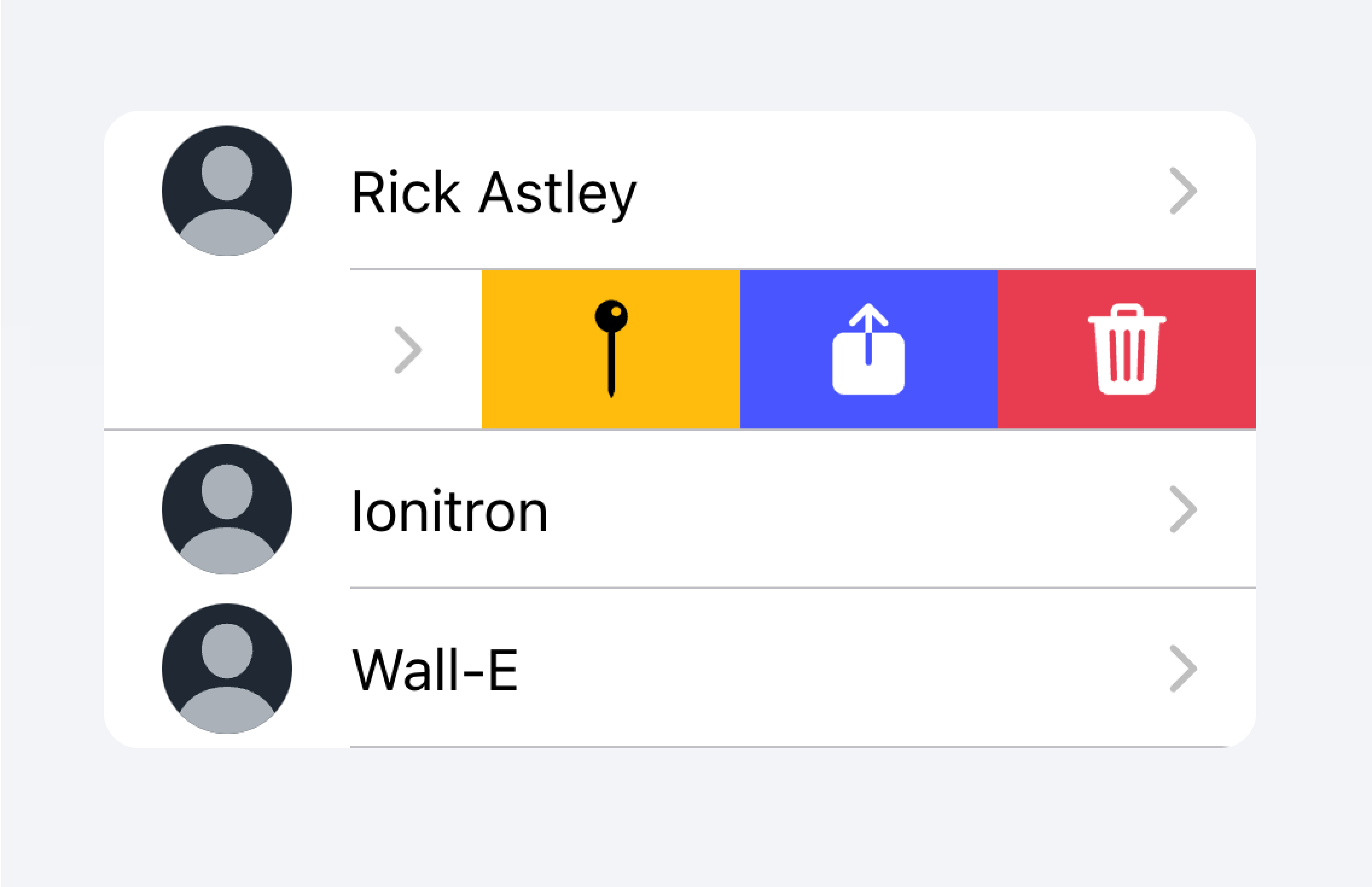
Use an Item Sliding to reveal multiple actions by swiping on the Item.
Don't put more than 2 actions within an Item.
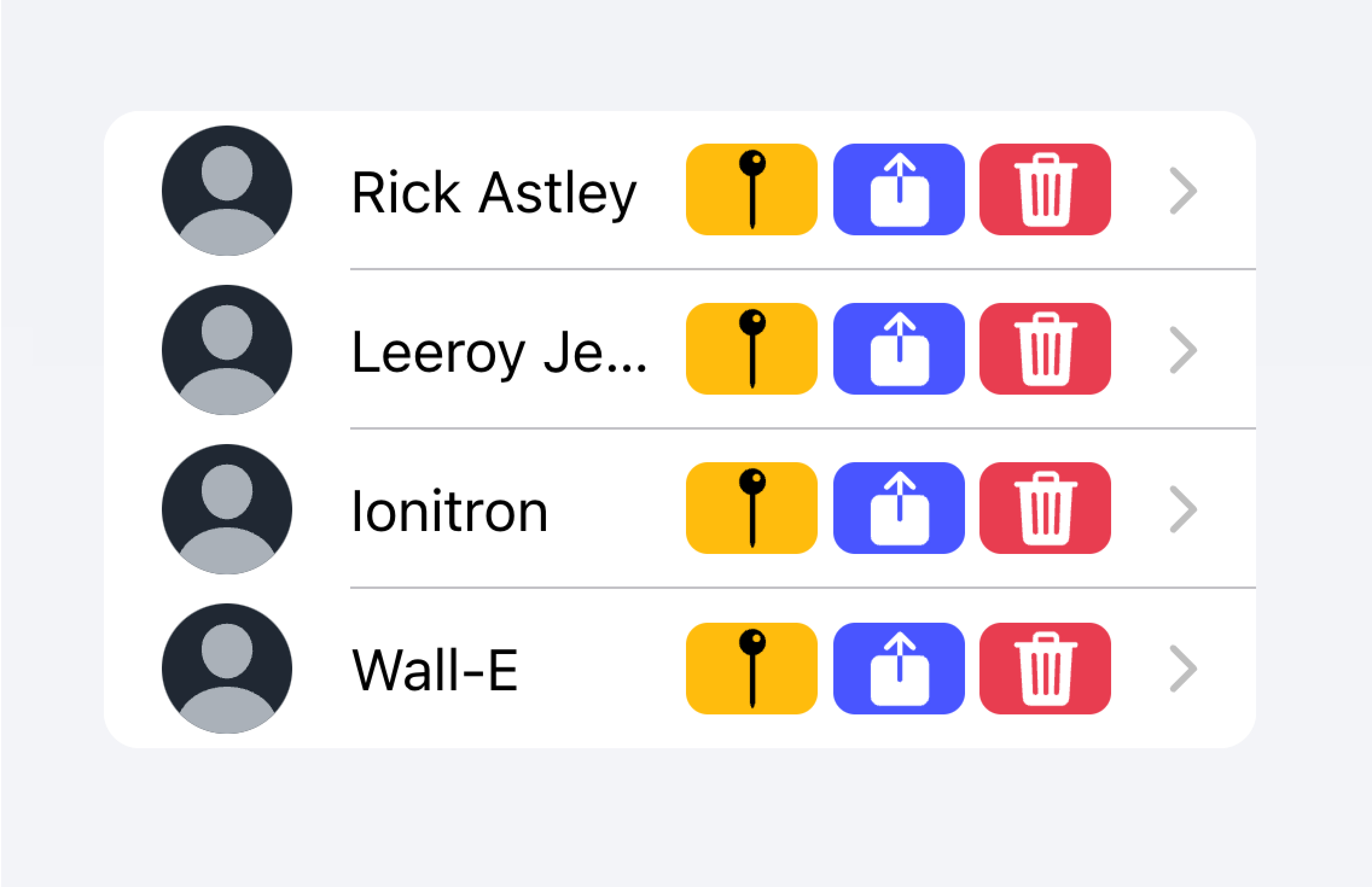
在下面的示例中,我们正在创建一个联系人列表。每个项目都是一个模拟按钮,旨在将你带到该项目的完整联系人页面。每个项目还关联有其他操作,用户可以通过在项目上滑动来显示这些操作。
🌐 In the example below, we are creating a list of contacts. Each item is a stubbed button intended to bring you to the full contact page for that item. There are additional actions associated with each item that users can reveal by swiping on the item.
控制
🌐 Controls
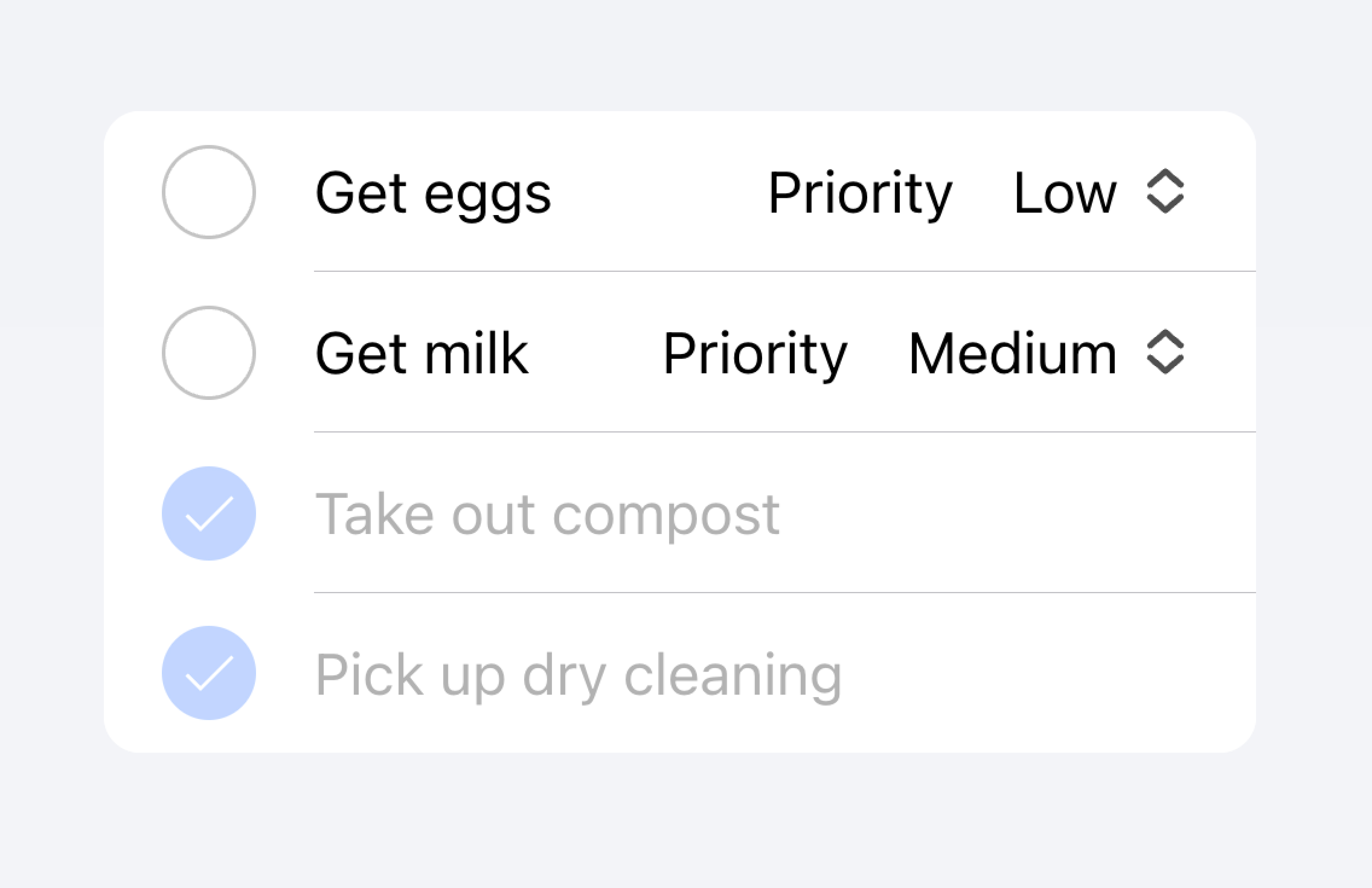
控件是表单组件,如复选框、输入框、单选按钮等。由于屏幕空间限制,列表中的每一项最多应有两个控件。
🌐 Controls are form components such as checkboxes, inputs, radios, and more. Each item in a list should have at most two controls due to screen space constraints.
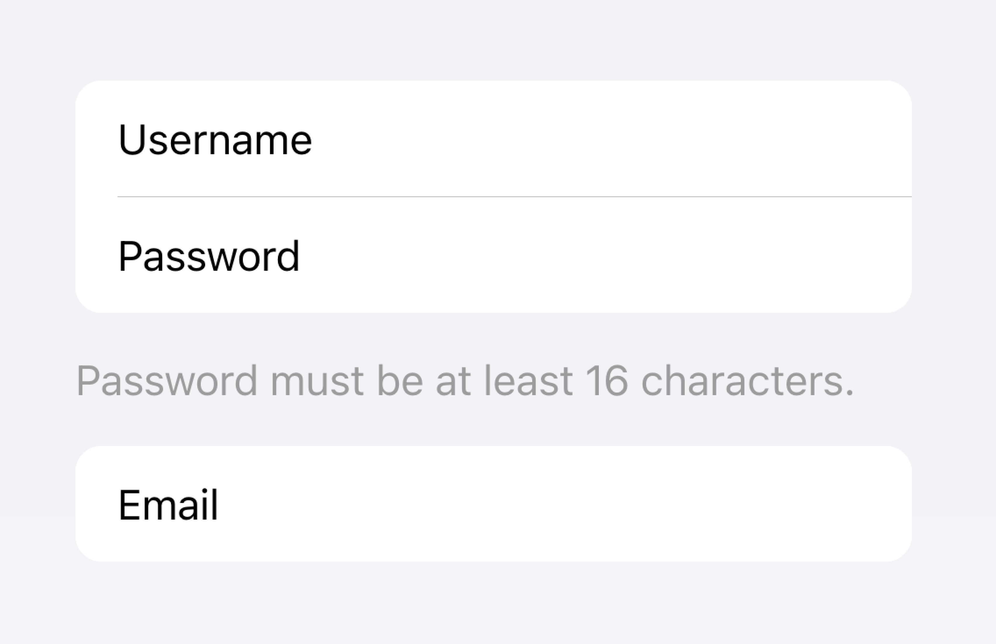
Metadata such as helper text or character counts should not be used on form controls in list views. If such metadata is needed, the form control should be placed outside of a list. Filled Inputs are a great way of visually defining the input container outside of a list.
Place inputs with metadata outside of the list.
Don't put metadata for inputs in the list.
Alternatively, the metadata can be placed in a Note at the bottom of the list.
Place metadata for inputs at the end of a list.
Don't put metadata for inputs in the list.
Items should typically have no more than two controls. If you need more controls, consider adding the additional controls in a Modal that is accessible from the item.
Move additional controls to a submenu accessible from the item.
Don't use more than two controls within an item.
在下面的示例中,我们正在创建一个待办任务列表。每个项目都有一个复选框和一个输入框。复选框允许用户将任务标记为已完成,输入框允许用户更改任务的名称。
🌐 In the example below, we are creating a list of to-do tasks. Each item has a checkbox and an input. The checkbox lets the user mark a task as complete, and the input lets the user change the name of the task.
可点击的项目
🌐 Clickable Items
如果一个项目设置了 href 或 button 属性,则该项目被视为“可点击”。可点击的项目有一些视觉差异,以表明它们可以被互动。例如,在 md 模式下,可点击的项目在激活时会收到波纹效果,在 ios 模式下激活时会有高亮显示,并且在 ios 模式下默认有一个详细箭头。
🌐 An item is considered "clickable" if it has an href or button property set. Clickable items have a few visual differences that indicate they can be interacted with. For example, a clickable item receives the ripple effect upon activation in md mode, has a highlight when activated in ios mode, and has a detail arrow by default in ios mode.
细节箭头
🌐 Detail Arrows
默认情况下,可点击项目 在 ios 模式下会显示一个右箭头图标。要在可点击元素上隐藏右箭头图标,请将 detail 属性设置为 false。要在本身不显示右箭头的项目上显示右箭头图标,请将 detail 属性设置为 true。
🌐 By default clickable items will display a right arrow icon on ios mode. To hide the right arrow icon on clickable elements, set the detail property to false. To show the right arrow icon on an item that doesn't display it naturally, set the detail property to true.
条目行
🌐 Item Lines
项目默认显示内嵌下边框。边框在左侧有内边距,并且不会出现在任何插入到 "start" 插槽中的内容下方。lines 属性可以修改为 "full" 或 "none",分别显示全宽边框或不显示边框。
🌐 Items show an inset bottom border by default. The border has padding on the left and does not appear under any content that is slotted in the "start" slot. The lines property can be modified to "full" or "none" which will show a full width border or no border, respectively.
项目中的按钮
🌐 Buttons in Items
按钮在项目内部的样式比在项目外部时要小。要使按钮大小与项目外部的按钮匹配,请将 size 属性设置为 "default"。
🌐 Buttons are styled smaller inside of items than when they are outside of them. To make the button size match buttons outside of an item, set the size attribute to "default".
条目输入
🌐 Item Inputs
主题化
🌐 Theming
颜色
🌐 Colors
CSS 阴影部分
🌐 CSS Shadow Parts
CSS 自定义属性
🌐 CSS Custom Properties
指南
🌐 Guidelines
以下指南将有助于确保你的列表项易于理解和使用。
🌐 The following guidelines will help ensure your list items are easy to understand and use.
- 项目应该仅在 列表 内使用。
- 列表中的项目应以一致的格式渲染。例如,如果你的项目显示装饰图标,图标在各个项目之间的位置应保持一致。
- 项目绝不应渲染嵌套交互元素。当使用嵌套交互元素时,屏幕阅读器无法选择正确的交互元素。例如,避免将按钮放置在具有
button="true"的ion-item中。 - 正确使用内容类型。Item组件被设计为列表中的一行,不应作为通用容器使用。
无障碍
🌐 Accessibility
键盘交互
🌐 Keyboard Interactions
<ion-item> 在满足以下任一条件时具有以下键盘交互方式:
🌐 An <ion-item> has the following keyboard interactions when any of these conditions are met:
button属性设置为"true",从而渲染一个原生的<button>元素。href属性被设置,渲染一个原生<a>元素。routerLink属性被设置,渲染一个原生<a>元素。
| 键 | 描述 |
|---|---|
| Tab | 将焦点移动到下一个可聚焦的元素。 |
| Shift + Tab | 将焦点移动到上一个可聚焦的元素。 |
按钮
🌐 Button
当一个 <ion-item> 渲染一个原生 <button> 元素时,键盘交互遵循与 button role 相同的模式:
🌐 When an <ion-item> renders a native <button> element, the keyboard interactions follow the same pattern as the button role:
| 键 | 描述 |
|---|---|
| 回车 | 激活该项目,触发其 click 事件。如果该项目位于表单中且 type 设置为 "submit",则提交表单。 |
| 空格 | 激活该项目,触发其 click 事件。即使该项目 type 是 "submit",也不会提交表单。 |
锚点
🌐 Anchor
当一个 <ion-item> 渲染一个原生 <a> 元素时,键盘交互遵循与 link role 相同的模式:
🌐 When an <ion-item> renders a native <a> element, the keyboard interactions follow the same pattern as the link role:
| 键 | 描述 |
|---|---|
| Enter | 激活该项目,导航到链接的页面或将焦点移动到页面内目标。 |
属性
🌐 Properties
button
| Description | If true, a button tag will be rendered and the item will be tappable. |
| Attribute | button |
| Type | boolean |
| Default | false |
color
| Description | The color to use from your application's color palette. Default options are: "primary", "secondary", "tertiary", "success", "warning", "danger", "light", "medium", and "dark". For more information on colors, see theming. |
| Attribute | color |
| Type | "danger" | "dark" | "light" | "medium" | "primary" | "secondary" | "success" | "tertiary" | "warning" | string | undefined |
| Default | undefined |
detail
| Description | If true, a detail arrow will appear on the item. Defaults to false unless the mode is ios and an href or button property is present. |
| Attribute | detail |
| Type | boolean | undefined |
| Default | undefined |
detailIcon
| Description | The icon to use when detail is set to true. |
| Attribute | detail-icon |
| Type | string |
| Default | chevronForward |
disabled
| Description | If true, the user cannot interact with the item. |
| Attribute | disabled |
| Type | boolean |
| Default | false |
download
| Description | This attribute instructs browsers to download a URL instead of navigating to it, so the user will be prompted to save it as a local file. If the attribute has a value, it is used as the pre-filled file name in the Save prompt (the user can still change the file name if they want). |
| Attribute | download |
| Type | string | undefined |
| Default | undefined |
href
| Description | Contains a URL or a URL fragment that the hyperlink points to. If this property is set, an anchor tag will be rendered. |
| Attribute | href |
| Type | string | undefined |
| Default | undefined |
lines
| Description | How the bottom border should be displayed on the item. |
| Attribute | lines |
| Type | "full" | "inset" | "none" | undefined |
| Default | undefined |
mode
| Description | The mode determines which platform styles to use. This is a virtual property that is set once during initialization and will not update if you change its value after the initial render. |
| Attribute | mode |
| Type | "ios" | "md" |
| Default | undefined |
rel
| Description | Specifies the relationship of the target object to the link object. The value is a space-separated list of link types. |
| Attribute | rel |
| Type | string | undefined |
| Default | undefined |
routerAnimation
| Description | When using a router, it specifies the transition animation when navigating to another page using href. |
| Attribute | undefined |
| Type | ((baseEl: any, opts?: any) => Animation) | undefined |
| Default | undefined |
routerDirection
| Description | When using a router, it specifies the transition direction when navigating to another page using href. |
| Attribute | router-direction |
| Type | "back" | "forward" | "root" |
| Default | 'forward' |
target
| Description | Specifies where to display the linked URL. Only applies when an href is provided. Special keywords: "_blank", "_self", "_parent", "_top". |
| Attribute | target |
| Type | string | undefined |
| Default | undefined |
type
| Description | The type of the button. Only used when an onclick or button property is present. |
| Attribute | type |
| Type | "button" | "reset" | "submit" |
| Default | 'button' |
事件
🌐 Events
No events available for this component.
方法
🌐 Methods
No public methods available for this component.
CSS 阴影部分
🌐 CSS Shadow Parts
| Name | Description |
|---|---|
container | The wrapper element that contains the default slot. |
detail-icon | The chevron icon for the item. Only applies when detail="true". |
inner | The inner wrapper element that arranges the item content. |
native | The native HTML button, anchor or div element that wraps all child elements. |
CSS 自定义属性
🌐 CSS Custom Properties
- iOS
- MD
| Name | Description |
|---|---|
--background | Background of the item |
--background-activated | Background of the item when pressed. Note: setting this will interfere with the Material Design ripple. |
--background-activated-opacity | Opacity of the item background when pressed |
--background-focused | Background of the item when focused with the tab key |
--background-focused-opacity | Opacity of the item background when focused with the tab key |
--background-hover | Background of the item on hover |
--background-hover-opacity | Opacity of the background of the item on hover |
--border-color | Color of the item border |
--border-radius | Radius of the item border |
--border-style | Style of the item border |
--border-width | Width of the item border |
--color | Color of the item |
--color-activated | Color of the item when pressed |
--color-focused | Color of the item when focused with the tab key |
--color-hover | Color of the item on hover |
--detail-icon-color | Color of the item detail icon |
--detail-icon-font-size | Font size of the item detail icon |
--detail-icon-opacity | Opacity of the item detail icon |
--inner-border-width | Width of the item inner border |
--inner-box-shadow | Box shadow of the item inner |
--inner-padding-bottom | Bottom padding of the item inner |
--inner-padding-end | Right padding if direction is left-to-right, and left padding if direction is right-to-left of the item inner |
--inner-padding-start | Left padding if direction is left-to-right, and right padding if direction is right-to-left of the item inner |
--inner-padding-top | Top padding of the item inner |
--min-height | Minimum height of the item |
--padding-bottom | Bottom padding of the item |
--padding-end | Right padding if direction is left-to-right, and left padding if direction is right-to-left of the item |
--padding-start | Left padding if direction is left-to-right, and right padding if direction is right-to-left of the item |
--padding-top | Top padding of the item |
--ripple-color | Color of the item ripple effect |
--transition | Transition of the item |
插槽
🌐 Slots
| Name | Description |
|---|---|
| Content is placed between the named slots if provided without a slot. | |
end | Content is placed to the right of the item text in LTR, and to the left in RTL. |
start | Content is placed to the left of the item text in LTR, and to the right in RTL. |